ENJOY 15% OFF ON YOUR FIRST ORDER | CODE FIRSTORDER15 ENJOY FREE SHIPPING OVER 500€ DISCOVER THE ATELIER, CUSTOM YOUR ORDER!

Home World

TOUR THE BRIGHT CONTEMPORARY SPIN ON GOTHIC REVIVAL DUTCHESS COUNTY, NEW YORK

Restraint is one of the most powerful yet underappreciated weapons in a designer’s armory. Consider the Dutchess County that interior designer Ghislaine Vias recently refurbished. The Dutchess County is set on nearly 100 acres of rolling hills village of Tivoli, New York. This house was built in 1850 and restored a decade ago by Trimble Architecture. With landscape by Pamela Burton. Vias and her clients ultimately opted to take it easy. “At first, we considered replacing the fresh white paint with something softer. But because the house’s experience is so much about the land’s majesty, and the white provided such a great contrast to the lush greenery and trees, we just went with it,” the designer continues. Many of the home’s interior features, such as steel-framed beds, sisal carpeting, and oatmeal-colored linen drapes, were also kept by her and the homeowners. “Everything was calm and basic, which was ideal for the atmosphere, so we retained everything.” Even yet, Ghislaine had a lot of work to match the intimidating home’s appearance and personality to her customers’ frolicsome attitude. Vias achieved this by using delicate greens and blues inspired by nature. Additionally, vibrant contemporary artworks and modern furniture are alternatively cheeky and enticing. Consider the Moooi pig table in the entryway, which greets guests. It’s a cheerful piece. The bedroom in the attic is another opportunity for a lighthearted coup de théâtre. The entire walls and ceiling wrapping paper is a graphic Gucci paper. With the details of lion heads. TOUR THE BRIGHT CONTEMPORARY SPIN ON GOTHIC REVIVAL DUTCHESS COUNTY, NEW YORK Indeed, despite porcine tables; Studio Job breast-form sconces; neon-orange Tom Dixon seats, the real spirit of the house is the homeowners’ extensive art collection. It includes works by a broad spectrum of artists working in various mediums. A huge Jill Greenberg photograph of a bald eagle is a statement piece in the dining room. Coupled with contrasts of Kehinde Wiley portrait plates with traditional 19th-century portraits. It makes a witty observation on how the concept of gentry has changed over the last 200 years Moving forward, a stairway with a suite of photographs by photographer Henry Hargreaves. To conclude, the designer says, “with Ghislaine, we share a love of whimsy. But we were much more restricted in our selections than in our past collaborations. ” Basically, we added a lot of flashes of color and intrigue without obliterating the house’s individuality.” Credits: Archtectural Digest

INSIDE THIS BRIGHT NATE BERKUS AND JEREMIAH BRENT-DESIGNED 1925 TUDOR

Before the introduction of the California modernist movement in the early twentieth century, many homes in Southern California were constructed to gaze inward, with unexpectedly gloomy chambers shielded from the unrelenting light. That was the case of designers Nate Berkus and Jeremiah Brent. The darkness and the stiff interior were the biggest difficulties for the duo in their new project. The priority of business for the designers was to combine smaller, separate rooms to create more expansive, airy areas for the kitchen and breakfast rooms and the main bedroom suite. To bring in more natural light, they also opened the entry foyer and mezzanine gallery and installed new iron and glass doors and windows throughout the house. “We just left the entrance door as the only original door or window.” “Every layer we removed freed up the home and gave it a whole new presence,” says Berkus. NATE BERKUS AND JEREMIAH BRENT-DESIGNED 1925 TUDOR Nate Berkus and Jeremiah Brent remodeled the Tudor house built in 1925 in L.A.’s Hancock Park neighborhood. The clients were Brian Robbins, president of the Nickelodeon network; his wife, stylist Tracy James; their young daughter, Stella; and Robbins’s sons from a previous marriage, Justin, and Miles. This Family asked for a friendly and warm house appropriate for a modern family. The duo furnished the living room with a combination of pedigreed, centuries-spanning furniture and accessories. Perhaps best reflects the airy and brilliant spirit of the designers. Nate Berkus and Jeremiah Brent kept a white,off-whites, and neutral tone palette when designing the house. Thanks to the white paint, this particular room was really dark, and now it’s bright. Spruce modernist furniture, such as a pair of Pierre Guariche lounge chairs and a massive; articulated Stilnovo sconce from 1954, soften the space’s formality. “Juxtaposing modern and contemporary objects with Tudor architecture creates tension. Berkus comments that the gentle, curving forms of the furniture give a sense of fluidity. The designers adopted a similar method to change the dining room look, which had previously been painted blue and had a dark brown floor. Berkus and Brent put classic Mario Bellini Cab chairs around the customers’ existing dining table. The duo put it beneath a graphic grid of overhead lights. After repainting the floors in a much lighter tone and painting the space white. “It’s complex, yet it’s still youthful.” Brent describes the renovation as “making it a joyful environment.” NATE BERKUS AND JEREMIAH BRENT PROJECT Happy is the word to characterize the designers ‘ emendations from the expansive main bedroom to Stella’s pink palace to the bright breakfast room that now leads to a new kitchen focused on a 17th-century limestone fireplace expertly turned into a stove hood throughout the property. Brent’s redesigned landscaping, created in collaboration with Rolling Greens, gives the house a fresh new look while also providing several outdoor entertaining and relaxation possibilities. The designers state that they really fell in love with this client. They describe them as kind and engaging people. Therefore, the duo wanted to give them a home that reflects the beauty of the family. Credits: Architectural Digest

RENOVATION TRENDS FOR 2022

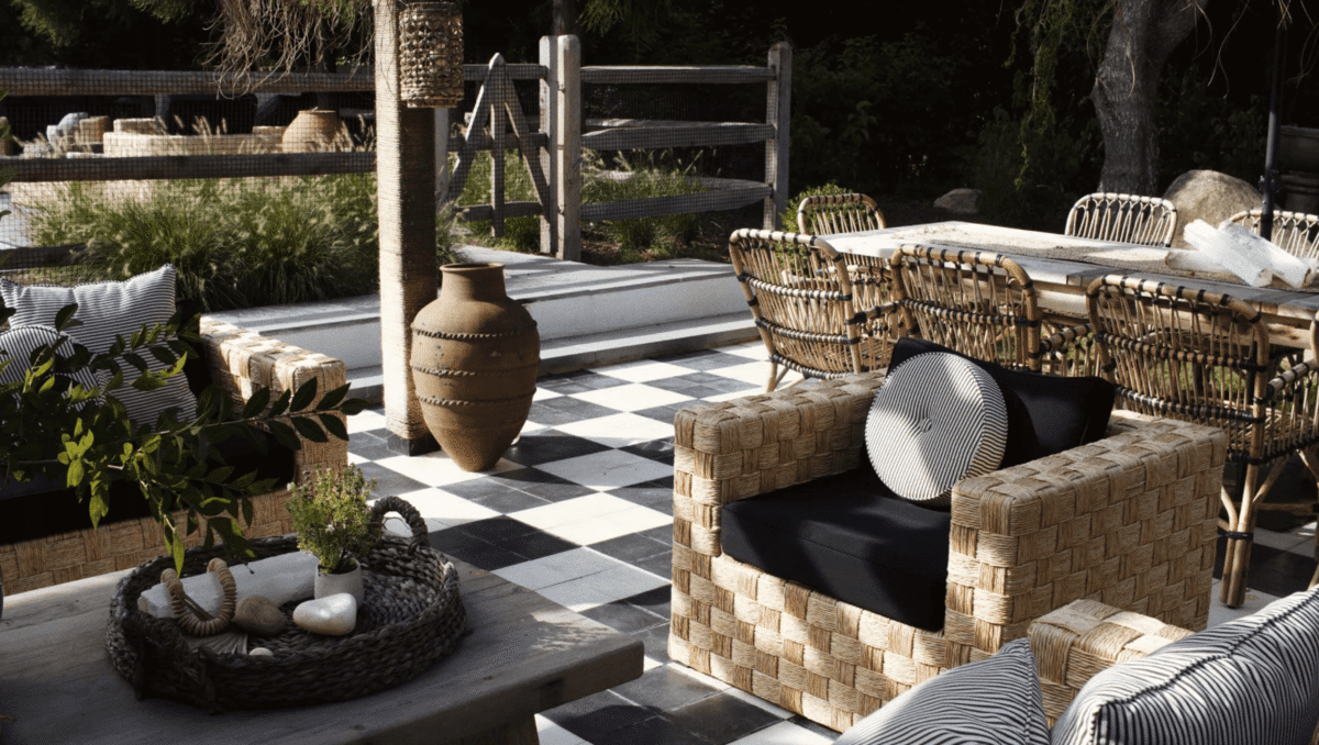
Due to the pandemic, 2021 was an uphill battle full of uncertainty. People spend most of their time at home working or taking care of their families. Till this year some people preferred to work from home. Thanks to that, people are dedicating more time to renovating their homes. Continue to read to see the renovation trends for 2022. Home Office Jean Brownhill, the founder of Sweeten, states that in 2022, there will be an increase in home offices. Homeowners are switching kitchen counters for more professional spaces. The remote tiredness is real, but so is the background of your home environment. You can convert sitting rooms, small family spaces, guest rooms into a home office. Enhanced outdoor spaces and features In 2022, we are bringing the indoor out for some time. We are seeing more outdoor living rooms that look like indoor spaces. Outdoor areas continue to be the space where people spend most of their time. In the last years, there have been a lot of advances in outdoor materials. Manufacturers now use durable outdoor sofas, tables, rugs, chairs, and décor. Mitchel Parker, senior editor at Houzz, search data show that people want their backyard to be a relaxing extension of their interior areas. Texture All Around The texture is the biggest renovation trend that David Steckel, a Thumbtack home expert, sees for 2022. Leave in 2021 the flat finish walls and welcome the surfaces that you will want to put your hands all over. Devin Shaffer, the lead interior designer at Decorilla, states that the clients are getting tired of basic paints. They are looking for dimension and visual interest. Devin Shaffer continues to say that in 2022, new lines of 3d wall panels are popping out, which designers love the modern and contemporary projects. Technology from start to finish The interior design in 2022 will make significant technology advancements. Before Covid, the digital interior designer was already on the rise. Companies such as DecorMatters are implementing artificial intelligence to automatically suggest products for their clients. We expect more home decor apps and design firms to implement more technical at their workplace. Going Bold Another renovation trend for this year is wallpapers. Current trends showed homeowners using wallpaper with bold patterns in the room Where they want to bring color and texture. Homeowners prefer it because it is easy to install or swap out. Also, wallpaper lets people express their personalities. Side Hustle Spaces Gemma Ribberti says that in 2022 side hustle rooms will see a rise. Thanks to the entrepreneurial mindset, especially Gen Z and Millennials. They create everything possible, transforming our homes into flexible layers of activity. Being green and figuratively Due to the pandemic, people realized health, the environment, and being less materialistic. With that said, reusing furniture buying biological or recycled materials will be a renovation trend for 2022. Natural materials like wood and clay will pair perfectly with any style or other material. Connecting with nature For years, people have been requesting more natural light in their homes. Homeowners are increasing the natural light of their houses and connecting with nature. This renovation trend will continue in 2022. They added doors that were windows and large windows to connect to the outside. Also, homeowners are replacing traditional backyards doors with large scenic ones. Durable surfaces Property owners are expecting, in 2022, more excellent performance from their surfaces. Most homeowners spend a lot of time at home cleaning their countertops. Homeowners are getting more knowledge on the maintenance required for countertops. Since then, the demand for solid acrylic surfaces has been increasing. They are seamless and offer durability with no additional care. Credits: Architectural Digest

8 DESIGN PROGRAMS YOU NEED TO KNOW

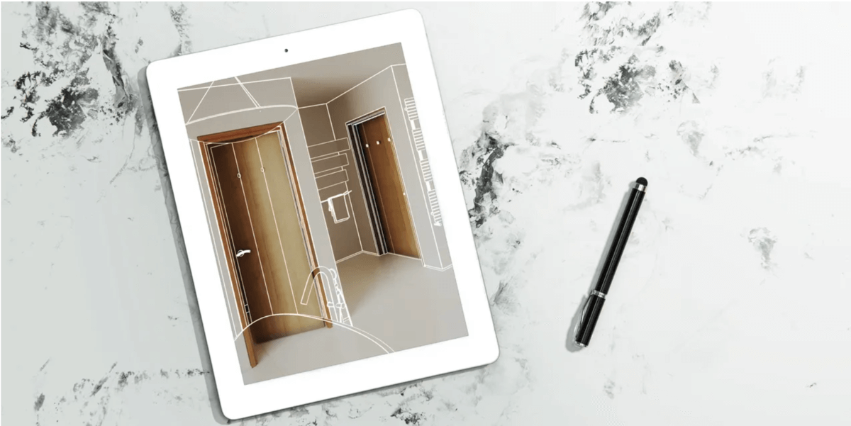
If you are running a big company or starting now, using design programs will help you grow your business. The right program will help you generate good results. When it comes to finding the best software, each software has its specialization. Some platforms are meant for a big or small company. 1- Autodesk AutoCAD LT Autodesk AutoCAD LT is one of the most popular design programs. This software lets professionals design, draft, and draw 2D geometry. It’s used by decorators, architects, engineers, and more. This is a top designer selection because of its rich editing and annotation capabilities and easy-to-use user interface. You may work on sketches online from practically any computer using an integrated AutoCAD web application with a simple interface and no program installation required. Users may view, edit, annotate and create drawings on their smartphone or tablet at any time. Even when there’s no internet. You may also circulate a project with the rest of your team or provide comments without mistakenly modifying an existing drawing owing to its share and trace options. AutoCAD LT is compatible with both Mac and Windows operating systems, and the latest version adds cloud connectivity, improved measuring features, and quicker performance. AutoCAD LT comes with a free trial and a $55 monthly charge. 2- SketchUp Pro Design pros will discover fast, simple 3D modeling for everything from passive structures to modern furniture using SketchUp Pro’s modeling package. Create accurate scaled designs in 2D, then customize the styles and materials to bring your idea to life. Because these design programs work with virtual reality systems like Microsoft HoloLens, HTC Vive, and Oculus, you can practically walk your clients through a project in progress. SketchUp has a web tool and limitless cloud storage in addition to its traditional desktop interface, allowing you to store, collaborate effortlessly, and share your work. This software also allows the designer to measure building data and examine anticipated energy use and other elements. Therefore, you can precisely calculate the performance and the hit post-occupancy goals. Once you complete the task, the design program will create a report to keep all the stakeholders informed. SketchUp Pro costs 269$ annually, but if you don’t want to spend a lot, you have the free version. 3-TurboCAD TurboCAD’s most recent editions provide professional software for experienced 2D and 3D CAD users. The architectural design package includes mechanical design and modification capabilities, allowing users to accomplish everything from 3D printing prototypes to drafting furniture designs. TurboCAD promotes itself as a “powerful alternative” to AutoCAD LT. Realistic surface modeling and lighting allow users to produce spectacular presentations. It is available for both Mac and Windows operating systems. Internal and external database connectivity, as well as file-sharing options ensure that your team can easily integrate and cooperate. 4-Autodesk 3ds Max Clients will see your suggested work in spectacular, high-tech detail thanks to Autodesk’s 3ds Max. The interior design program produces stunning graphics for 3D animations, models, games, and photographs. Create high-quality renderings using the toolsets, and fine-tune every interior and item to the last detail. When it comes to productivity, automated procedures may help you streamline deadlines and content creation. Users may examine precise and detailed previews while working with the integrated, interactive Arnold renderer. This program is only compatible with Windows operating systems and costs $215 per month. 5-Live Home 3D Pro Live Home 3D Pro is one of the design programs that allows you to create exact plans and furnish rooms—or a complete building—quickly and effectively. After you’ve created 2D blueprints, the program will automatically convert them to 3D. With the platform’s new split mode, you can compare your 2D and 3D models side by side. Advanced sketching tools, elevation views, a materials library with hundreds of furniture and appliances, and bespoke materials and lighting editors are also available in the desktop version (for Mac or Windows). Geopositioning and daylighting options aid with siting and lighting selections, and video walk-throughs may be made and exported as Ultra HD files at any time of day or night. Plan and video files may also be saved and shared in various file formats. Industry specialists on a budget may appreciate this introduction to interior design software that can handle more complexity, which costs $50 for the Mac or Windows-powered desktop application and includes a free interior design app with optional in-app purchases. 6- Archicad 25 Archicad, produced by Graphisoft, is one of the most popular choices in architectural rendering software. With comprehensive capabilities; a straightforward interface, and a BIM application that allows you to generate beautiful ideas. Users may swiftly move from 2D to 3D models, document zone-specific data, and benefit from the platform’s more exact cost projections in its most current version, Archicad 25. Users may freely work with other essential stakeholders owing to its Native Survey Point capabilities and interoperability with other systems like Revit and Solibri. Archicad is available for Mac and Windows operating systems, with full perpetual, term-based, and educational licenses. 7- Easyhome Homestyler Homestyler is the ideal room design programs if you need a simplified tool to shape your ideas. With this application, you can create floor layouts in 2D and 3D with correct measurements. Once you’ve mastered the basics, click over to the Homestyler library to add hundreds of genuine products to your depiction. You and your clients may now stroll through a photo-realistic panorama simulation created by Homestyler. Plus, you can design on the move with a complementary app (available for iOS and Android). Users may upgrade to a pro or master account for a monthly price of $5 or $10, respectively, while the primary platform is free. This might be the software for you if you’re starting in the interior design company and are on a tight bud 8- Infurnia Infurnia is a cloud-based design platform that allows people to collaborate and engage throughout the design process. Detailed floor plans with multilayered walls, sophisticated tiling and roofing, artificial ceilings, and customizable cabinet tools are all available to …

Read more

PICK INSIDE THIS UPPER EAST SIDE HOUSE WITH A MODERN TOUCH

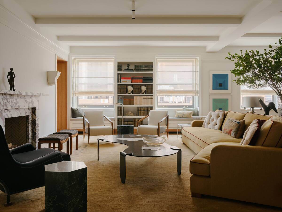
This Upper East Side house is a union between two homes, remodeled by interior designer Andre Mellone. Elegantly with a view of Central Park is the refined house to a young family of five. Moreover, it’s a mixture of early 20th-century European design and American Modernism. The project took two years to idealize after the owner’s second apartment purchase, which was empty and located across the hall from the first home. Andre Mellone designed this house with utility in mind for the couple and their three children. The designer had to remodel the Upper East Side house with as much space as possible based on the family’s needs. Putting aside the delays thanks to the pandemic. The designer states some of the challenges for the renovation like the public elevator hall, fire stairs, cluster of inaccessible storage rooms of the two apartments. However, the common area in the Upper East Side house came in hand for the designer. If you enter the apartment in one direction, you have the kid’s bedroom. In the other direction, you have access to other rooms. A powerful north-south split emerged from the vast internal hall. Windows on the far north walls, which have been altered from their original designs, provide oblique views of the park and stream light from the city’s west side. The bar, dining room, kitchen, and dining area became relaxing spaces on the left side of the hall. UPPER EAST SIDE HOUSE WITH A MODERN TOUCH If you take a right turn on this Upper East Side house, it leads to the bedrooms and bathrooms. With the help of architect Anik Pearson, Andre Mellone and his team found inspiration from Art Deco. The vision between the designer and the client was aligned when it came to the design. The final result of the Upper East Side house was incredible. It’s an elegant apartment with a European touch. It’s deliciously harmonic when you put it all together. A delicate color palette of ochres, golds, and grays complemented by a collection of elegant texture options that resemble wood paneling, herringbone flooring, velvets, and lots of marble. The designer defined the bigger living room and library with statement pieces. A magnificent fireplace in the vast living area serves as the final focal point, complemented by two old Swedish chairs wrapped in Aissa Dione fabric. The Milan’s Villa Necchi Campiglio fireplace is angular and difficult to ignore. It appears to be an overall tour de force of old and modern. The open living room is a place to entertain the guests. Mellone decorated with bespoke Gio Ponti armchairs and a Holland Sherry sofa. Also, the clients incorporated their artwork as decoration. The fireplace sits a vintage Marco Zanuso armchair and a Rogers and Goffigon velvet upholstery on the left side of the fireplace. A pair of handcrafted white wood screens form an entry vestibule to the 4,000-square-foot residence, and the tasseled mirror is classic Carlo Bugatti. UPPER EAST SIDE HOUSE, NEW YORK The small living room has a classic Johannes Spalt couch covered in Schumacher corduroy; cushions wrapped in Aissa Dione fabric in the tiny living room. Alongside a vintage Jacques Adnet armchair in Rogers and Goffigon velvet, massive plaster and gilded relief by Roger Mequinion stand above the sofa. The visible ceiling beams are original to the structure. The powder room has an oak and high-gloss black stain finish. The floor is New Saint Laurent stone, and latte-colored wall coverings by Holly Hunt add texture.  Above the sink is a vintage Italian mirror that the client had. Andre Mellone used mirror walls to bring out the lights in the dining room. Versus the wall is a vintage cabinet by Le Corbusier; dining table and chair by Green River Projects. The ceramics are by a Portuguese artist, Bella Silva. The kitchen’s white wood millwork contrasts with Imperial Danby marble worktops. Originally from the Brazilian mint, Casa de Moeda do Brasil, two genuine Brazilian Art Deco plates are mounted on the island support beam. PICK INSIDE THIS UPPER EAST SIDE HOUSE WITH A MODERN TOUCH The breakfast room adjoins the kitchen and serves as a less formal family eating area. A custom Studio Mellone banquette and dining table, as well as an antique Archimede Seguso pendant light and vintage Charlotte Perriand dining chairs, are shown. Andre Mellone warmed the library with brushed white wood joinery and wall paneling. A historic Edward Wormley upholstery desk chair in Aissa Dione silk and a bespoke Studio Mellone couch covered in corduroy by Raf Simons for Kvadrat. The walls are in the shade Dove Wing in the primary rooms by Benjamin Moore paint. The rug and the headboard are custom made. Vintage Borens lamps are on the side of the bed and above the bed is an artwork by Jose Albers. Inspired by Pieri Portaluppi, the main bathroom pays tribute to the Milan Villa Necchi. The marble is Calacatta Monet, and the black tiles are Pratt Larson. The sink and adorning fittings are by Mirabelle and Rohl. Credits: Architectural Digest

GET TO KNOW THIS COLOURFUL TRIBECA PLAYFUL FAMILY HOME

At the moment that designer Olivia Stutz got challenged to transform a family home condo in New York Tribeca into art-driven, she got really excited. The designer was so happy that Elle Langston, the local nail salon Paintbox founder, and her family trusted her vision. Olivia Stutz moved to New York three years ago from San Francisco to launch her design studio. When designing the three-bedroom loft, she used textures and color, with structural and metallic elements. Therefore, reflecting Elle´s aesthetic of outing two colors together. Which is something that the nail founder does in her nail studio. Together with the New York artist Alex Proba, the designer remodeled this Tribeca playful family home. The living room includes a custom-made rug with a vast space and high and floor ceilings windows. The three white Stairway bookshelves are piled and stocked with CB2, Urban Outfitters, and Zara Home accessories. A copper bowl by Brooklyn studio Fort Standard, JWDA table lamps by Danish firm Menu, and a burnt orange light by Entler is among the items on display. The designer states that styling was a big part of the family home design. Olivia used Elle and her husband’s existing furniture, such as velvet sofas, Gubi dinnerware, and Milo Baughman chairs. To highlight the family home, the designer used sculptural and metallic elements. Including a tubular steel chair designed by Jumbo; a matching chrome piece; a geometric floor lamp, and a white structure in the middle of the couches. The designer got inspiration from Ettore Sottsass and the 1980 Memphis movement. Olivia found some of the family home pieces in a sample sale. TRIBECA PLAYFUL FAMILY HOME Stutz´s remodeled the living lounge area with a neutral tone for a clear feeling. With a white sofa, white rug, and driftwood photograph by Keith Ramsdell. The main bedroom family home decorations use the same neutral tones. Combining the white and the gray upholstered wall. Neutral palettes don’t mean tedious. Stutz incorporates playful elements in the room. For example, the black side tables with oak drawers and the hardwood floors combined with bespoke white lamps. Texture, pattern, and color are all there at all times. The designers adore the combination of marble and sheepskin, as well as the sharp edges. Olivia utilized more metallic and geometric items throughout the apartment to bring everything together, including the kids’ playroom. The playroom/ guest room is incorporated a golden Half Moon Mirror by Ben and Aja Blanc. Elle and her husband already possessed the circular, black marble dining table and green Beetle dining chairs in the dining room, both by Danish manufacturer Gubi. Credits: Architectural Digest

GET TO KNOW THE WASHINGTON RESTAURANT, IMPERFECTO

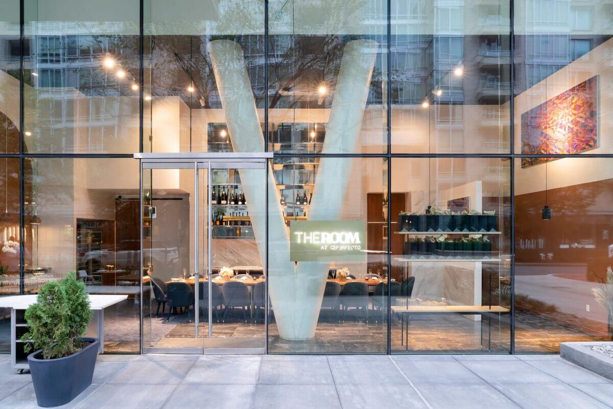
Located in Washington, USA, Imperfecto is a mix of Mediterranean and Latin American cuisine. Materials such as marble, wood, and brass are some of the materials used in the restaurant’s design. OOAK Architects, a studio in Athens and Stockholm, designed Imperfecto. With the help of the photographer and art director Yiorgos Kordakis.The architect company conquered this project thanks to an invited competition. The company’s name stands for One of a Kind, is directed by Maria Papafigou and Johan. Other projects designed by the company are a concrete house on a rocky cliff at the Greek island Karpathos. When the company designed the Washington restaurant, the group found inspiration from Mediterranean standards. For example, the blue and white color pallet used on the decoration. Imperfecto is defined as a “culinary experience whose imperfection originates from the miraculous synthesis of apparently contradictory materials, universes, and aesthetic identities.” Rectangular in a plan, the restaurant seats 98 guests. The front of the house separates into three sections: the bar, the main dining room, and the chef’s table. The architects used neutral tones with blue and white tones all around the eating area. The Washington restaurant has white walls and different textures that reflect light in distinctive ways in each room. Recently the restaurant had an upgraded. The designers added a private dining room and outdoor furniture. GET TO KNOW THE WASHINGTON RESTAURANT, IMPERFECTO The OOAK architects used various materials, including wood, terracotta, and marble. The rooms have custom-made furniture and pieces from well-known artists and leading brands like Verpan and Marset. The restaurant team stated that the architects incorporate high-quality materials like Greek and Italian marbles. As well as brass and wood from various places in the world, designing a diversity of textures in the restaurant. At the entrance of the Washington restaurant, a maître stand made of burl wood, with ceramic pieces, stand out. The bar is on the other side of the lobby, with big arches as custom-made lights and an abstract photograph of a Greek quarry by Kordakis. The snow-white marble bar has crimson red chairs. On the other side is the main dining room, with wooden tables and chairs covered in Kvadrat fabrics. Drop-shaped glass fixtures by Swedish artist Simon Klenell hang above the people’s heads. The lighting fixtures give out a pleasant glow designed to evoke the “comfort of the sun over the Aegean.” The team incorporated a row of “silos” with leather banquettes and circle tables on a back wall in the main room. On the ceiling are round enclosures that conceive a pod-like feeling. The chef table area is near the main room, equipped with a standard table made of elm. Plus, leather chairs and cylinder brass lights from Orbium. To conclude, the team coated the back wall with a zig-zag screen made of terracotta. Credits: Dezeen

TOP DESIGNER TINEKE TRIGGS SOULFUL INTERIORS

Get to Know Tineke Trigg’s soulful interiors. Combining art with science, she made her name by creating one-of-a-kind homes that fit specific lifestyles and traits. Tineke views each project as a collaborative experience that mixes the client’s taste with her creativity. Her creativity comes from her passion and curiosity. Tineke’s inspiration comes from the designers who thought outside of the box. She is recognized for her passionate, creative, and inventive interiors. Trigg’s work creates distinct design mixology by integrating art and science. Her sophisticated interiors stimulate the senses and deliver on the details that make rooms genuinely unforgettable. Thanks to Tineke´s soulful interiors, she has been featured in many publications such as Architectural Digest, Elle Décor, and Veranda. When she´s not designing, Tineke does kickbox, spends time with family at the beach, and travels the coast with her Airstream. She lives in San Francisco, California, with her husband, Wiil, and their two teenage sons. The designer describes that her personal style arises from her love of unexpected designs. All projects are different but originated in creating elegant rooms that are lavish and cozy. Tineke designs her soulful interiors in a way that is personal to each homeowner. She believes that design inspiration comes from anywhere you look. Therefore, her inspiration comes from everything. For instance, travel, nature, architecture, old buildings, shape, fashion, and a horse saddle. TOP DESIGNER TINEKE TRIGGS SOULFUL INTERIORS Regarding social media, the designer manifests that it can be a great font of inspiration. She enjoys going through Pinterest and Instagram to find design inspirations. ​One of the best parts about social media is that it exposes you to new styles and products from all around the world. In the past, information was limited, but now social media brings a lot of vital information. It keeps people connected to what´s happening worldwide in design. As for decorative pieces, to make up the soulful interiors, the designer states she loves to select the lighting pieces. She considers that it is a statement piece that makes a room feel complete. Moreover, when asked about the next trend in the interior design world Tineke Triggs, states that colors are coming back. After being cooped up for a year, people are ready to add more color to their lives. They are also using more unique shapes and geometric elements in their designs. These patterns are evocative of the Memphis movement of the 1980s, but they are more livable and relevant. When it comes to her approach and philosophy after designing a room, Tineke gets to know the client first and then creates the soulful interior project. She approaches each project with new eyes, curiosity, and passion. To determine what home means to each client, how they will live there, and how they want to feel. She imagines in pictures following the early encounters, and design ideas will come to her head. To conclude, the designer’s design inspiration is Tommi Parzinger. She always praises his works and love for technique. Credits: Artemest

MODERN MINIMALIST RESIDENCE DESIGNED BY BELOUSOVA INTERIOR

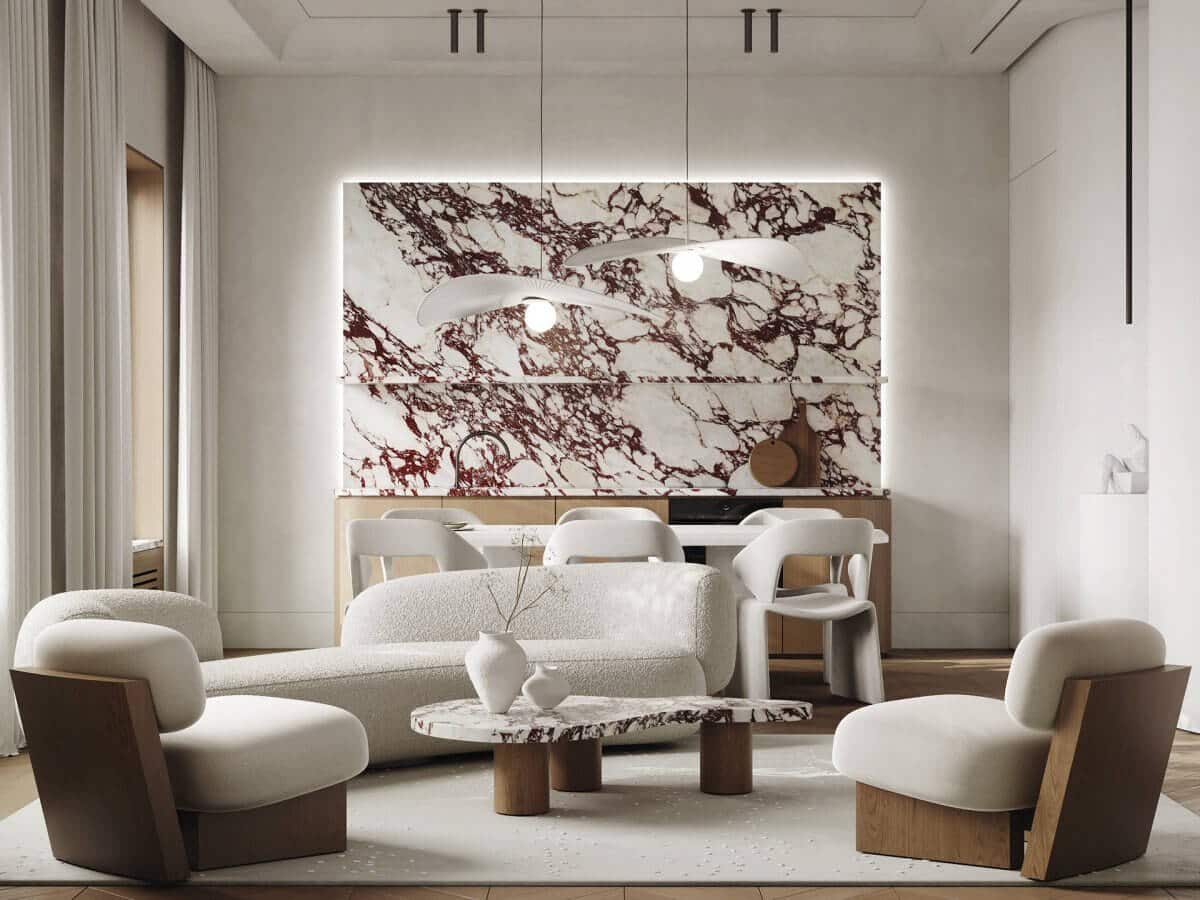
Modern-minimalist interior designs remain popular, and design firms strive to make each design project distinctive and reflect the owner’s personality. Belousova interior, a Russian design studio, specializes in designing rooms that appeal to its clients’ senses. This enabled them to build one-of-a-kind and individual projects for each client. The studio seeks to design rooms that are visually pleasing and useful. Essentially rooms that mirror the characteristics of the individuals who live in them. This particular modern minimalist is an excellent portrayal of visual aesthetics and the experiences that interact with the house. This modern minimalist secluded property in Moscow, Russia, is a reflection of its owner’s personality. The studio addressed this minimalist interior design with plain hues, but fun use of rich texture and distinctive, one-of-a-kind furniture types that dramatically complement this little, simple room. The neutrals are prominent throughout the apartment. The 66 square meter house is finished in whites, greys, and browns. The red marble that adds a splash of color to the area is a standout accent. Every single detail added has its own presence that complements the red marble in the living room. The texture is present also in every piece of furniture in the living room, bedroom, entrance, kitchen, and even bathroom. There is also a lighting game that enhances the entire apartment. This modern apartment lacks crisp lines and hard shapes in favor of warmer round, wavier shapes found in the furniture, details, and even the walls. This modern minimalist residence exudes indescribable tranquility. Its modern and minimalist interior design captivates the eye. This apartment is not for everyone, but those with minimalist and modern tastes might will like living here. Credits: Artemest

HOW TO CREATE A MODERN RUSTIC ROOM

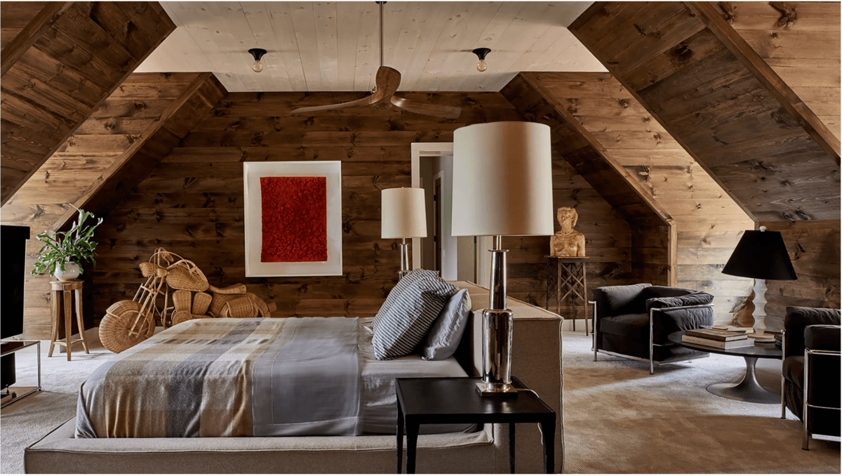
What can Oscar de la Rena, chef Andrew Carmellini, and hotel powerhouse The Four Seasons have in common? The three commissioned the New York design firm Meyer Davis to build custom-made modern rustic projects. Such as stores, restaurants, and estates. Will Meyer and Gray Davis joined forces in 1999. Since then, they have created a reputation for themselves. Thanks to their welcoming interiors, projects seem structured and relaxing at the same time. They use a variety of materials while retaining a clean, modern vibe. For instance, in a lake house at Copake, New York, the duo used raw wood walls and jute-wrapped pipes combined with modern furnishings idealizing a modern rustic décor. Furthermore, at the Bowery Meat Company, in Manhattan, the firm used comfortable velvet banquettes and stunning walnut-paneled walls to inflame the industrial aesthetic. These and other projects are included in the firm´s book Made to Measure, where we can see the modern rustic style that the firm stands by in its projects. Gray and Will used a lot of natural elements while constantly keeping the rooms looking clean. They discovered that having a polished, more structured contrast with the materials helps one to appreciate the other. In addition to recognizing the natural material´s attributes better. When it comes to the difference between decorating a private and public space, the duo expresses that they don´t differ. By not distinguishing between the two, the firm is free to concentrate on building significant environments that people can enjoy as a home or a hotel. HOW TO CREATE A MODERN RUSTIC ROOM They center a story on a central concept to start a modern rustic project. Then, the duo blends specific aspects with subtle references and elements to build a narrative. As regards the material, the firm seeks an assemblage of components that correspond to the modern rustic project. They frequently use wood in their projects. Nevertheless, in the end, it is about designing a balanced room where components connect. Credits: Architectural Digest

CALIFORNIA 60´S DESIGNED REFINED HOME

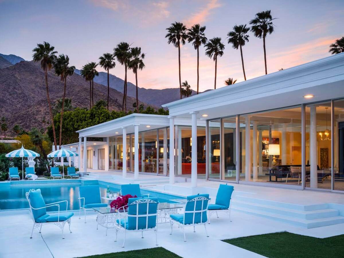
Ed Cole and Christopher Wigand remodeled their house to a refined house in California with a 60´s design style. The end effect is a lustrous house with a lot of personalities. REFINED HOME IN CALIFORNIA When Ed Cole and Christopher Wigan, looked for a house in Southern California, they specified a midcentury property with original charm. The search was difficult because most of the 60´s decor houses were completely remodeled. In the end, they chose the house previously owned by media magnate George Randolph Hearst. The legendary mansion was designed by Hollywood set designer James McNaughton. At the start, McNaughton envisioned a grand property with a mystical aura and a massive gateway adorned with metal medallions. Cole and Wigan discovered an outdoor area enclosed by Romanesque sculptures, columned belvederes, and mirrored ponds. The 8,000 square feet of glass-walled rooms, Palladian-style villa needed more work than expected. The interior designer and contractor Stoker Inc. developed the project. ANTHONY COCHRAN BACKGROUND Anthony Cochran creates interiors that are both personal and distinctive by mixing cultures, periods. The vast rooms provide a welcoming atmosphere. Small spaces have a certain sense to them. Every aspect of the decor and lifestyle is taken into account when developing environments that are classy and yet unintimidating. The challenge was in creating a new look while keeping the past’s individuality. When renovating the home’s original decoration and layout were taken into consideration. The new owners intended to remodel with their extensive furniture collection, which included Italian classics and statement pieces. Everything came together beautifully in the end. Credits: Architectural Digest

Tour a French Riviera Home with Mid-Century and Modern Details

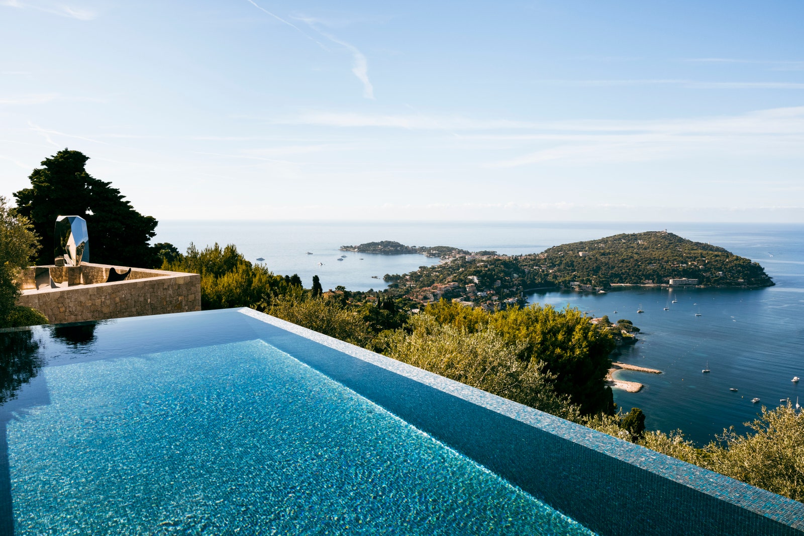
Take a closer look at this French Riviera home that is located in Côte d’Azur. It features a worthy modern interior design, with mid-century details you will love. Jean-Eric Gnuva is the owner of this French Riviera Home after he asked for a complete transformation. The first request of Gnuva was that “He wanted the space to feel luxurious, almost as if it were an ultra-high-end hotel,” explains Jean-Charles Tomas, the interior designer. Tomas said that the first agreement was to renovate the kitchen. But, once Gnuva saw it and saw the work has been done, he decided to make a general renovation. The entire renovation took two years, mostly because of Covid 19. Gnuva stayed at home and it was practically impossible to get things done. “It was interesting because COVID-19 made everyone rethink their relationship with their own home,” Tomas says. “Jean-Eric just happened to be renovating his [house] during this moment of reflection.”. Tomas had a few challenges once he was renovating this French Riviera home, but one of the main ones was the structural elements of the abode could not be touched. However, Tomas is a master in solving problems and that’s what he did. He said that “We put in a fake column, which created three little nooks. This really opened up the space and made it more functional with a bespoke desk, a small cabinet, and a lounging area for reading.” Côte d’Azur Home Renovation As mentioned before, Tomas built a fake column (right), which made three small niches. That permitted the room to consistently incorporate a bespoke work area, little cabinet, and settee. Jean-Eric Gnuva had one important thing on his mind, that besides every room had an amazing view, but Gnuva didn’t utilize it because of the materials of the window. So Tomas changed them to harmonious tones using wood.   Last, but not least, we have to talk about this outstanding view, because it’s speechless. Regarding this point of the home, Tomas says, “Because no matter what we do inside of a home, nothing can really compete with the views.” And we couldn’t agree more! Credits to: Architectural Digest

Form PopUp Download Ebooks
Privacy policy
Please select a valid form

More Info

Please select a valid form

This form is currently closed for submissions.

NEW DECOR CATALOG

THE BOOK THAT WILL TRANSFORM YOUR HOME INTO A CHARMING PLACE.

NEW DECOR CATALOG
Privacy policy
Subscribe Newsletter Right Widget
Privacy policy
METAMORPHIK HOUSE AT DECOREX 2022

METAMORPHIK HOUSE AT DECOREX 2022

Step into our Metarooms reality and enjoy exclusive benefits

Privacy policy