ENJOY 15% OFF ON YOUR FIRST ORDER | CODE FIRSTORDER15 ENJOY FREE SHIPPING OVER 500€ DISCOVER THE ATELIER, CUSTOM YOUR ORDER!

Home World

CHROMATIK HOUSE Virtual Tour At Fuorisalone 2022

ACH Collection & ACH4Pets join HOMMÉS Studio in the chambers of Museo Bagatti Valsecchi to introduce CHROMATIK HOUSE at Fuorisalone 2022 with an overwhelming virtual tour. For its first time at Milan Design Week, ACH Collection and HOMMÉS Studio take the chambers of Museo Bagatti Valsecchi to introduce CHROMATIK HOUSE – Improbable Interiors and Provocative Design, a synaesthetic experience that blends reality and imagination. HOMMÉS Studio combines an on-site showcase with four simulated living spaces that guests discover through an overwhelming virtual tour. How many realities can you see? is the question to be answered in the third edition of Palazzo delle Meraviglie at Fuorisalone 2022 from 7 to 12 June. About CHROMATIK HOUSE CHROMATIK HOUSE is a hyperphysical exhibition by Hommés Studio alongside ACH Collection, ACH4Pets, and Tapis Studio, taking part in the third edition of Palazzo delle Meraviglie at Museo Bagatti Valsecchi in the heart of downtown Milan. The synaesthetic experience invites visitors to explore a metaverse version of a traditional home using their primal senses  – hearing, sight, smell, and touch – to explore a space that blends real and imaginative, leaving them wondering whether the future is still unwritten or it is a mere rebirth of classical philosophies and aesthetics.  CHROMATIK HOUSE is an unseen experience conveying a series of different atmospheres, themes, and aesthetics. Based on four movements – NeoClassic, NeoSurrealism, NeoPop, and NeoPrimitive, the Porto-based design studio will set a scenario that blends classical proportions, dreamlike silhouettes, and unexpected colors with a construction based on human emotion. How Many Realities Can You See? For its first time at Milan Design Week, ACH Collection joins HOMMÉS Studio and takes the chambers of Museo Bagatti Valsecchi to introduce CHROMATIK HOUSE, a synaesthetic experience that blends reality and imagination. HOMMÉS Studio combines an on-site showcase with four simulated living spaces that guests discover through an overwhelming virtual tour. How many realities can you see? is the question to be answered in the third edition of Palazzo delle Meraviglie at Fuorisalone 2022. Within the same space, ACH Collection celebrates the heritage of European design and manufacturing and explores what role plays the industry’s tradition in metaverse interior and architecture design. The on-site exhibit reveals the strong influence of three beloved design movements, namely Memphis Milano, mid-century modernism, and art deco, on the contemporary fingering of the brand born in 2019. From Porto to Milan, the Portuguese design studio brought a handful of modern decor objects and luxe pet accessories. For instance, at the chambers of Museo Bagatti Valsecchi, you can enjoy the texture of an array of decorative pillows, appreciate the touch of handcrafted ceramics, or imagine your dog or cat sleeping in a cozy pet bed. CHROMATIK HOUSE Virtual Tour CHROMATIK HOUSE‘s simulated reality reveals a home with four unexpected rooms beyond what one can imagine – CHROMATIK HOUSE, A-MAZE-ING RUGS, PILLOW PARTY, AND ULTRA DESIGN. ACH Collection and HOMMÉS Studio’s team have recreated the chamber of Museo Bagatti Valsecchi where the physical reality lies with pristine perfection. In the digital realm, the main room’s ceiling gains a life of its own with a flock of golden leaves emanating a glowy light. And every wall and nook is embellished with unexpected sconces, mirrors, decorative pillows, home decor objects, and incredible pet accessories. One room after another, the design studio reveals three other unexpected meta-living spaces in addition to the meta-version of CHROMATIK HOUSE itself. A-MAZE-ING RUGS is literally a maze of rugs to get you lost in the exciting designs from the new essential and vanguardist tapestry brand born under the umbrella of the Porto-based design studio – TAPIS Studio. At CHROMATIK HOUSE’s virtual tour, you can also enter the PILLOW PARTY digital room that nods to Netflix Squid Game’s playground with floating decorative pillows and an array of pet beds under a surrealist blue sky. Finally, as you walk inside CHROMATIK HOUSE’s meta version, you’ll find yourself knocking at the door of ULTRA DESIGN, a digital room with all HOUSE OF HOMMÉS brand new products with an ultra-modern aesthetic and playful energy to embellish real homes and homes in the metaverse. METAROOMS CHROMATIK HOUSE CHROMATIK HOUSE is a replica of the chamber of Museo Bagatti Valsecchi hosting the modern furniture and luxe decor objects of all HOUSE OF HOMMÉS brands – HOMMÉS Studio, ACH Collection, ACH4Pets, and the newly launched TAPIS Studio. In this digital real, CHROMATIK HOUSE reveals an interior design without boundaries. PILLOW PARTY PILLOW PARTY is a room exclusive to ACH Collection’s amazing decorative pillows, home accessories, and decor objects and to ACH4Pets tailored pet beds and sophisticated accessories, presented in an open-air gallery with a surrealist charm. A-MAZE-ING RUGS A-MAZE-ING RUGS is a digital showroom showcasing some of the designs from the newly launched rug brand TAPIS Studio. In the most playful manner, you can discover the first TAPIS Studio’s essential, eco, outdoor, pets, and kids rugs with incredible designs and handcrafted details. ULTRA DESIGN ULTRA DESIGN gathers in a single room all new products launched by all HOUSE OF HOMMÉS brands with an ultra-modern aesthetic and playful energy to embellish real homes and metaverse homes that celebrate the best of European design and manufacturing. You can still visit CHROMATIK HOUSE until 12th June from 10 am to 7 pm at Museo Bagatti Valsecchi at Via Gesú, 5.

Upper West Side apartment

A Well Visual Balanced Upper West Side Apartment

This Upper West Side apartment with 2,400 square feet was recently remodeled by Studio LAB Design. It is located in an antique building from 1925. As for the interiors, the family with their two-year-old son and the dog trusted Justin Charette Design. Charette’s vision was based on durability, functionality, and the budget for this home. The family specifically chose specific areas of the house to be renovated. This Upper West Side apartment is perfect for this small family, thanks to the amount of storage space. With the functionality in the head, the designer incorporated a sleeper sofa in the living room and a queen sofa bed in the playroom. For most of the loft, the color scheme is neutral. However, the couple wanted to incorporate color into their home easily. Therefore, the designer picks some patterns and colors to dynamize the home décor. If you want to add some pop of color to your home, choose from these Ach Collection accessories. The loft brings out calm vibes through every room. However, some statement pieces, such as the kid room ceiling, can be seen in the family home. In the children’s room, the designer used high-end leather furniture fabrics with stain-proof surfaces. Plus, high-quality rugs. In the living room, the leather sofa sits on a Stark rug. The artwork above is by Bradley Duncan. The simple yet beautiful coffee table is by Rove Concepts, and the floor lamp is by Serge Mouille. The children’s room is all in black and blue shades. The sofa is by Design Within Reach and is complemented by a mickey mouse-shaped pillow. The play table and the chairs sit on Crate and Barrel rug. In the nursery room, the furniture creates a cozy atmosphere. Source: Interior Design

coral tone decor ideas

8 Coral Tone Decor Ideas to Bright Up Your Home

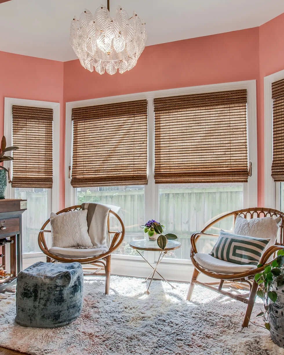
The coral tone was considered three years ago the color of the year by Pantone. Today, it’s still in style. According to Francesca Grace, coral tones are the new pink. This tone is a unique color that stands out in any room. If you want to incorporate this color into your home décor, continue reading and get to know 8 décor ideas. 1 – Georgia Peach – Benjamin Moore Considering the coral tones, for the CEO Susan Tynan´s entrance, the designer Zoe Feldman chose this tone. It showcases the art in a beautiful, impactful way. 2 – Red Earth, Farrow, and Ball In this project, a room by Nickey Kehoe, you can contemplate the beautiful coral tone that brings out happiness. It contrasted with the colorful bed. This famous tone is perfect to combine in a room with classic elements. 3 – Sweet Antoinette, Kilz The designer Janie Molster incorporated coral pib k stripes to stand out from the gold accessories. The gold details on the sofa and the statues in the living room give the room a classical style. 4 – Youthfull Coral – Sherwin – Williams In this room, the JL Design founder Jessica Davis did exactly what the client wanted. A fresh, fun, creating, and funky space. 5 – Setting Plaster, Farrow, and Ball For the living room to be bright and warm, Joshua Smith painted the ceiling of this living room with a coral tone. In contrast with the colder style of the walls and the furniture. 6– Winter Sky – Benjamin Moore The designer Jones Ghajar designed this teenage girl’s room with a coral tone. Without being too feminine, thanks to the raspberry tones. 7 – Sweet Melon – Valspar This vibrant coral tone bedroom is by Spot Lab cofounder Tessa French. In this room, when the sun sets in changes the color of the room 8 – Buttered Yam – Benjamin Moore To conclude, Kevin Isbell rearranges a bedroom into a mudroom. Just by painting the walls with a coral hue that brings back to the summer days. Source: House Beautiful

Townhouse

Inside a Georgetown Townhouse Inspired By Orient Express

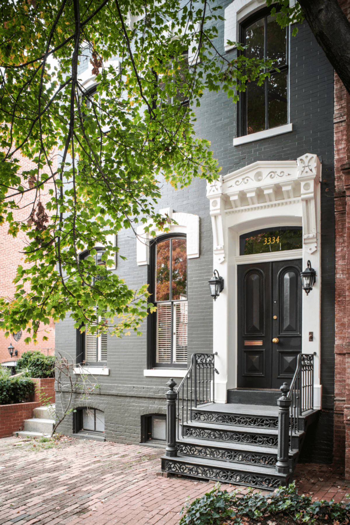
When Lorna Gross, Washington, D.C based interior designer, was asked to revamp an 1870 George Townhouse, she wasn’t expecting what would happen. Lorna Gross’s aesthetic of calming hues and elegant finishes keeps helping her find new clients. The designer expected the same challenges in turning a historic home into a modern house. However, for her surprised the client had a different idea. He wanted the home to look like a bespoke train car on the Orient Express. The historic house belongs to Greg Jackson, a writer, and historian. He got inspired by his time in Europe studying and living and his trips on the long-distance passenger train. To achieve the vision that Greg Jackson wanted, the designer incorporate vintage furniture and lighting on the first floor. Lorna demolished walls so that the visitor saw right away the long cozy corridor into the exteriors. In addition, the designer used antique chandeliers and wall covering to create a welcoming and a mix of antique and contemporary furniture. Even the kitchen, Lorna Gross totally renovated it to incorporate into the décor theme of the home For Lora, the challenge in this project was to create a story without being obvious that it was a train car. While the Orient Express was the main inspiration, the designer in the other rooms found inspiration in another theme. In the swank Hollywood gentleman lounge, the famous actor Cary Grant might frequent. Therefore, we can see that the light-filled guest room can also be the home office or the media lounge. Plus, the petite powder bath is filled with color and patterns. So, almost every room in this home includes luxury wall covers that create a cozy feeling. Jackson shared that the designer had a good eye for what he wanted. The house is located on a protected historic street light with Federal houses. Source: Architectural Digest

Mirror

The Incredible Art of Decorating With Mirrors

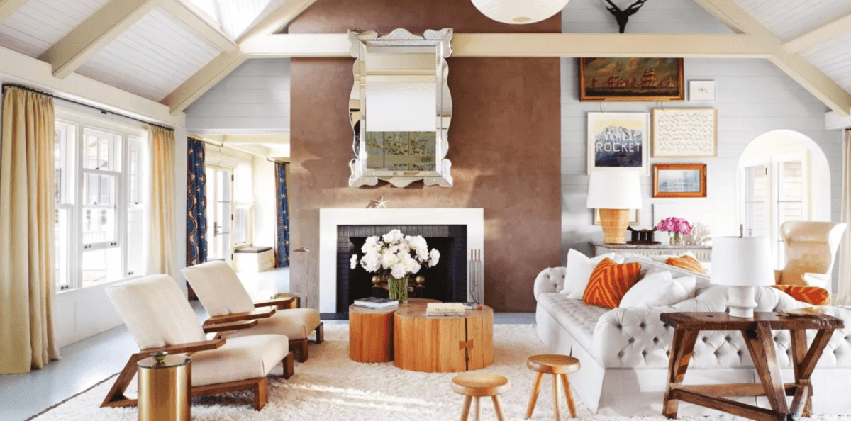
Are you ready to level up your decorating skills with mirrors? With these valuable tips from David Neto, you will be a pro. The German singer Nico once said, “I’ll be your mirror,” in one of her songs of the time. While everything that the singer said wouldn’t be taken seriously. Nowadays, artists agree with her visions. Mirrors have the power to transmit reflection with just one look. This Spring, in Tribecca, David Lewis Gallery showcases John Boskovich’s mirror work. His work cast its user’s different scenarios. In one, we can see a viewer sports a crown of thorns. Elsewhere in New York, you can see the colorful mirror canvases by Carlito Carvalhosa. In Bitforms, Daniel Rozin, an artist-technologist, shows his futurist art with mirrors, imagining them in motorized format. Regardless of your taste, this is the moment for you to embrace the power of mirrors in your home. To start, you must remember that the mirror-bright up the natural daylight in the house. You can follow the example of David Netto, an interior designer pushing the limits of architecture. Near Kensington Palace, the designer installed a mirror in a ground-floor maisonette where it wasn’t allowed to use doors. Another mirror seems to put a fireplace hovering in space. Clients sometimes think that mirrors can bring too much glamour. Their minds turn to Halston’s over-the-top hall mirror in Olympic Tower’s showroom. The designer reminds people that Dorothy Draper displays them with ease. With ornate frames and the symmetry of the classic Georgian Interior. On the other hand, people with a more modernist taste might think of Richard Neutra’s display of the full mirror on the top floor of VDL House. Decorating With Mirrors Like Katherine Thewlis of Hausmatter Interiors, you can try making a mirror into a window. For example, in the renovation of the designer home, she placed a mirror over the sink to frame a view back to the room. In whatever you do, use the mirror to gatekeep your moments and guide them. The designer, David Netto, used a mirror to hide clumsy plumbing in a previous apartment. To conclude, Netto suggests the absence of a mirror. He states that “sometimes a mirror absence, rather than a presence, is noteworthy.” The bathroom in an Upper East Side townhouse designed by Lorenzo Mongiardino has full-height Greek plates on the wall. Source: Architectural Digest

small-space

5 USEFUL TIPS WHEN DECORATING A SMALL SPACE

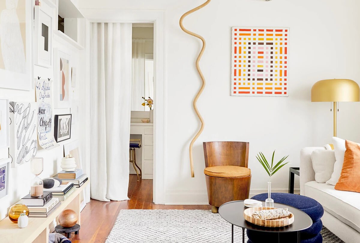
Just because you live in a small space doesn’t mean that you don’t have room for a stylish space. There are a lot of design hacks that will turn your small room into a comfortable and stylish space. To save your time, we wiil give you 5 useful tips that will help if you live or are thinking of moving into a small space. 1. LESS IS MORE The golden rule when decorating a small space is that less is more. Even if you have a small room, you don’t want to feel suffocated. Decorating a small room can be complicated because it can quickly look busier. Therefore, Henderson advises people to bring less furniture into the small space. In order to keep your small space clean, make sure that you organize your items and declutter sometimes. 2. THINK VERTICALLY The second tip is about thinking vertically. With more furniture on the floor, the room can feel clustered. Therefore, you should bring off the ground some pieces. Instead of a sofa with a solid base, you can use a sofa with legs. 3. MOVE TOWARDS MIRRORS Mirrors are perfect accessories to create the illusion of a bigger space. You can use a mirror to open up your small bathroom, entryway, etc. 4. MAKE EVERY PIECE COUNT To support the Less is More tip, Decorist designer Lauren Nelson advises people to be thoughtful when buying furniture. Choose pieces with multiple functions, saving up space in your home. 5. EMBRACE COLORS Using only white in your small space to give the illusion of a bigger place turns the room boring. Therefore incorporate in your small room different wallpapers and bold paint colors. Choose three materials/colors to decorate your home and start the renovation. Source: Design Milk

LOOK INSIDE THE 2022 KIPS BAY DECORATOR SHOW HOUSE PALM BEACH

Kips Bay began in 1973. In that year, ride-or-die supporters of the Kips Bay Boys and Girls Club launched the Kips Bay Decorator Show House. They created the house to raise funds for after-school and to improve programs for the New York children. For 47 years, Kips Bay Boys and Girls Club has celebrated the best interior designs by transforming a luxurious Manhattan house into an elegant display of fine furniture, art, and technology. For design lovers, Kips Bays is an unmissable event. Thanks to its power of driving interior design trends worldwide. In 2021, two events happened in Palm Beach and Dallas. This year, the first event took place in Palm Beach, Florida, on April 3rd. For the decor of the Kips Bay Decorator Show, the 24 designers didn´t look for inspiration. They turned to local styles from the past and present and then created vibrant rooms with the palette Florida is known for. KIPS BAY DECORATOR SHOW HOUSE PALM BEACH When it comes to these amazing designers, color and pattern and an overwhelming sense of caprice are always considered. Kips Bay Decorator Show House, located in the Old Northwood Historic District, marks the fifth fundraiser. Any design lover sees this house as an inspiration, regardless of where they live. The Kips Bays house is a combination of designs from the past and present. When guests arrive, they come forward the landscaping by Bell Design, Inc. That includes a festive pergola and elephant topiaries, signs of the authenticity of the interior rooms. Inside, layers of details from the county´s fanciful style meet the ceiling, railing details, and bold colors combinations. The way that the colors combinate makes the dining room shine through the house. KIPS BAY: DESIGNERS INSIGHTS To understand more about this year’s design choices, we collected some opinions from the designers. Paloma Contreras talks about her direction in the sunroom. The designer stated that many of the features are characteristic of Palm Beach; she wanted to display them in a modern and more restrained way than possible. Cathy M. Austin designed a bright, colorful casita as part of the guest house. She got her inspiration from the people she met. Moving Forward, Alice Engel of Peter Pennoyer Architects designed a living room inspired by the Florida ways. The designer shared that the tangerine grasscloth on the walls was a nod to Florida citrus cultures with a mural of lemon trees. Thus, all the rooms Kips Bays decorator show house Palm Beach are unique but complete each other. Source: Galerie Magazine

INSIDE THE DESIGNER CASEY KENYON PALE PINK NEW YORK HOME

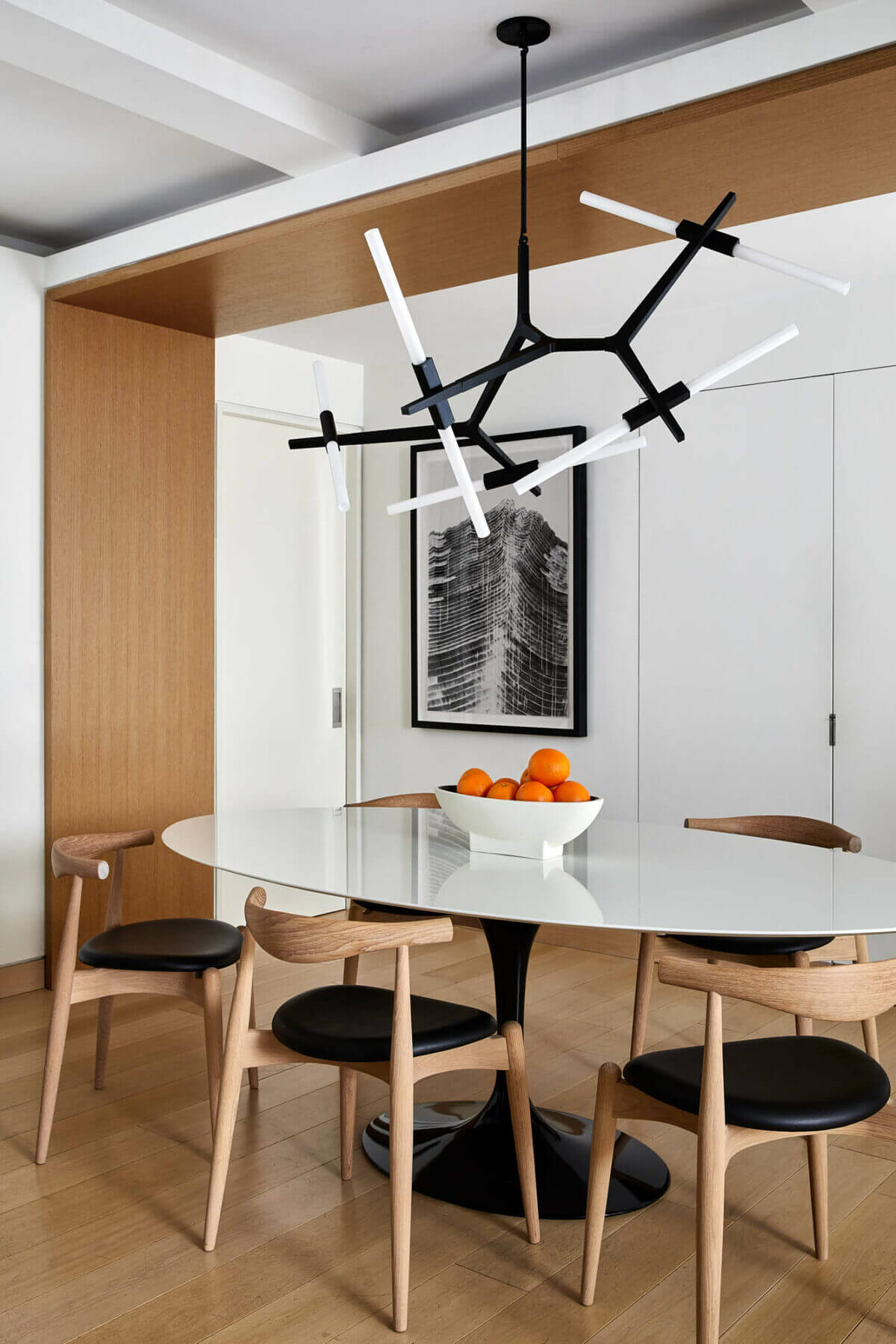
Designer Casey Kenyon may not be a well-known name, but it will be. Kenyon´s been working behind the scenes on the big projects AD has published. Nowadays, the designer is ready to conquer the world with his own business. Casey Kenson started getting into the design world right after college when he was Marc Jacobs’s assistant for six years. The designer loved the time that we worked with the famous fashion designer because of his knowledge. The designer represented the fashion guru when he bought a townhouse in Greenwich Village. Cases Kenson also worked alongside the designer Thad Hayes, John Gachot, and Paul Fortune. Once the house was done, Casey started working in Gachot Studios and then in Apparatus, where he was a design director. Two years went by, and the designer started his journey alone. INSIDE THE PALE PINK NEW YORK HOME Like many designers, Casey Kenyon’s most attractive project is his own house. A parlor-floor pink, pale apartment in Brooklyn, New York City. He lives there with his partner Jonathon Beck, and production designer. The apartment perfectly balances old-school New York residential finery and contemporary décor. It’s filled with color, patterns, texture, pedigree, and provenance furniture. Casey Kenyon painted the living room with Farrow & Ball´s Dead Salmon and Setting Plaster colors. It created a warm and welcoming environment for the combination of different furniture. Therefore elements like the club chairs, cocktails tables, an Oushak carpet, and a bespoke cabinet brought a vintage environment. The dining room is covered with a cocoon of panels upholstered in brown corduroy. It is a discreet way to the Apparatus chandelier, a marble table and chairs by Luigi Costa Dominioni for Azucena. The decoration continues to the bedroom, designed with shades of purple and burgundy. Additionally, with Karl Springer lamps, bedside tables by Paul Evans, and other iconic pieces. For the designer, a home needs to be a place to relax. When decorating, Casey likes to use color strategically. In the end, what counts is the little things like where you will put your side table or the tableware. Credits: Architectural Digest

STEP INSIDE THIS WELCOMING HOLLYWOOD HOME

This beautiful Hollywood home belongs to a very happy, generous, kind couple. The design principle of AD100 firm Studio Shamsshiri, Pamela, and the architect Ron Radziner stated that the couple radiates joy and positivity. Therefore, the couple wanted a house that transmitted what they were. An inviting space with zero pretension, where they can invite their friends and family and enjoy the time together. People like the couple living in the Hollywood home are always a blessing for most designers. For most projects, they are familiar with the struggles of working with more apathetic people. To add to the list, designers love a good space to work in, which this project had. The house is located in a really private urban area. It combines the main house with two independent guest houses/ offices. Pamela and Ron gave the couple exactly what they were looking for. The couple created a Pinterest board with various images transmitting what they wanted. An organic and woodsy landscape house. A whole detailed, modern home wrapped in burnt redwood siding, with a zinc roof and strategic elevations. The house is filled with big windows and skylights, bringing nature vibes all around. On the architectural side, the designers incorporated light wood window frames on the exterior of the house combined with the interior materials. The happy couple’s vivid, colorful art collection stands out more with the dark background. INSIDE THE HOLLYWOOD HOME In the center of the Hollywood home is the living room, which shows comfort and cozy ambient. Shasmshiri filled the space with overscaled chairs; a BDDW wood cocktail table with a record player; a Campana Brothers Favela chair, and a meshuggeneh Bless indoor hammock. The living room opens to the communal kitchen to facilitate communication when the couple has family or friends over. To separate the kitchen from the pantry, the designers put a wall of metal-framed glass. The pantry benefits from the large windows bringing light to the living room. The entire upper floor is for the couple-bedroom suite. The room atmosphere feels like you are rounded by trees. In the bathroom, the couple has heated floors, giving the luxury vibe that the Hollywood home needed. One of the big offices is a two-story with a pitched roof structure with one floor coated in zinc and the other one constructed on concrete block. The second office is a rectangular box with a garage door lined in zinc. Pamela decorated the offices in the same style as the main house with warm tones and modern furniture, like the Mira Nakashima dining table and chairs. The happy couple stated that building their home from scratch allows them to fully personalize the home to fit their lifestyle. It is filled with comfortable furniture and big windows that make the homeowner feel like they are in the middle of a forest. Credits: Architectural Digest

SKETCH´S ICONIC LONDON RESTAURANT CHANGED ITS MILLENNIAL PINK COLOR

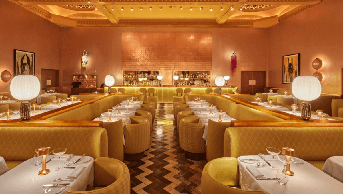
The well-known London restaurant changed its iconic millennial pink Pantone. Read more to see the remodeled restaurant. When we think about Sketch, the first image that comes to our head is their millennium pink ambient. However, the famous Instagram restaurant is no longer pink, thanks to renovations. It was renovated by Yinka Shonibare, a British-Nigerian artist, and India Mahdavi architect. Both visions came to life, as we can see from the bright and solar yellow around the restaurant. This changeset the mark for the restaurant that it currently counts 20 years of existence. Alongside the color palette, the London restaurant has 13 new site-specific designs supporting African Culture named Modern Magic. It completes the space with cooper walls and yellow fabrics to create a wholly unique atmosphere. Consequently, creating engagement on social media. ABOUT SKETCH This famous London restaurant located at 9 Conduit Street, in Mayfair- London. It’s open since 2003, and it’s been a success thanks to the restaurant’s design. Mainly because of the millennial pink theme. Mourad Mazouz is the owner of Sketch, and in the kitchen, the main chef is Pierre Gagnaire. The combination of the food and the place makes people come back repeatedly. IS THERE A COMEBACK FOR THE COLOR MILLENNIAL PINK? This significant change made people wonder and started a new chapter for the restaurant. However, people began to think that’s this was the end of this iconic millennium pink Pantone. Continue reading to see some expert opinions. According to Nadia McCowan Hil, yellow is the interior design color for this year 2022. Therefore, the change between the millennium pink and yellow was a natural thing to do. For a fact, Nadia stated that the millennial pink Pantone was the pastel of the decade. Nevertheless, in 2022 this yellow shade will be trending on our wardrobes and interiors. This year, we needed more fun and optimistic energy colors, and this yellow is the perfect fit. Benjamin Moore, Uk director, and Helen Shaw share the same opinion with Nadia. Along with the yellow, the expert suggests other tones such as coral, orange, and soft plaster. From her point of view, people are choosing more neutral colors than pink. For example, Venetian Rose Pink with grey undertones creates a vintage look. When we expect that millennial pink never goes out of style, this iconic Sketch renovation opens doors for different uses o trendier colors. Credits: Livingetc

HOW TO KEEP YOUR HOUSE CLEAN AND THE BEST CLEANING PRODUCTS TO USE?

If you are looking for the best cleaning products, you came to the right place. We selected the best products to keep your home super clean. 1- Clorox Disinfecting Bleach  Starting with the well-known cleaning products, bleach kills 99,9% of the germs in your house, including the coronavirus. This product is the most potent. That is why it is used in every place such as hospitals, restaurants, etc.  2- Reusable Cleaning Gloves If you don’t like having your hands wrinkle or if you are going to use powerful cleaning products like bleach, you should wear gloves. Enjoy and use it for other things such as washing the dishes, gardening, and other house chores. 3- Clorox Scentiva Wipes Bleach Free Cleaning Wipes If you are in a rush or need to clean a small surface, these cleaning wipes are perfect. This is like liquid bleach, with the same benefits but without any actual bleach. It can help take everything from lime soap to grease. 4- Disinfectant Spray  There is another crucial product when it comes to house cleaning. This spray kills 99,9% of the germs, and you can use it all-around your house. 5- Mr. Clean Extra Durable Magic Eraser Pads Moving Forward, these magic erased pads can do any cleaning task around your house. Such as removing scuff marks, polishing outdoor furniture, and removing makeup stains. 6- Barkeeper Friend Powdered Cleanser  Bar Keepers is perfect for taking any stain on stainless steel surfaces. You can use it on other surfaces such as ceramic, porcelain, and fiberglass. 7- Goo Gone Pro-Power Spray Gel You should hurry up and get this cleaning product if you have never used it. It takes any type of stickiness, gooey or gummy stains. Additionally, wet paint, glue, oils, and grease stains. The better part is that it leaves a great smell behind. 8- Hefty Ultra Strong Lavender Scented Kitchen Trash Bags  When It comes to the trash, we always think about the bad smell that comes from it. Thanks to their fantastic smell, these trash bags will make you take out the garbage more.  9- Method Squirt +Mop Almond Wood Floor Cleaner This non-toxic, plant-based floor cleaning product is convenient when cleaning the house. It dries quickly, and you don’t need to rinse. 10- Nature´s Miracle Urine Destroyer  Perfect for people with pets. We all know that sometimes, even with training, our pets can pee inside our house. This cleaning product takes all pet stains and can be used on hard floors, carpets, fabrics, etc.  As well, discourage your animal from peeing in the same place. 11- Drano Dual Force Foamer Clog Remover  If you are doing a deep cleaning day or have clogged toilets or drains, this product gets the job done. 12- Clorox Automatic Toilet Bowl Cleaner Tablets with Bleach  This cleaning product is perfect for constant cleaning. With every flush, it realizes a little bit of bleach. Between different cleaning sessions, you can pop one in the toilet tank. You should change them out every two or three months. 13- Arm & Hammer Baking Soda  Baking Soda is an excellent double-duty cleaner. This product can do everything possible. You can use it to remove rust stains, clean a mattress, wipe down kitchen countertops, do deep cleaning, etc. If you leave it in your freezer or fridge, it can absorb any smell. 14- Lucy´s Family-Owned Natural Distilled White Vinegar Vinegar is a multi-function product. You can use it combined with water as a glass or surface cleaner. Also, vinegar with baking soda makes a good disinfect product to clean your toilet. 15- Hydrogen Peroxide  Finishing our list of the best cleaning products is hydrogen peroxide. Besides using the product on wounds, you can make your windows sparkle. It only takes a spray bottle divided into three parts where one part is hydrogen peroxide and the other two water.  Credits: Architectural Digest

PICK INSIDE THIS LUXURY PARISIAN HOME

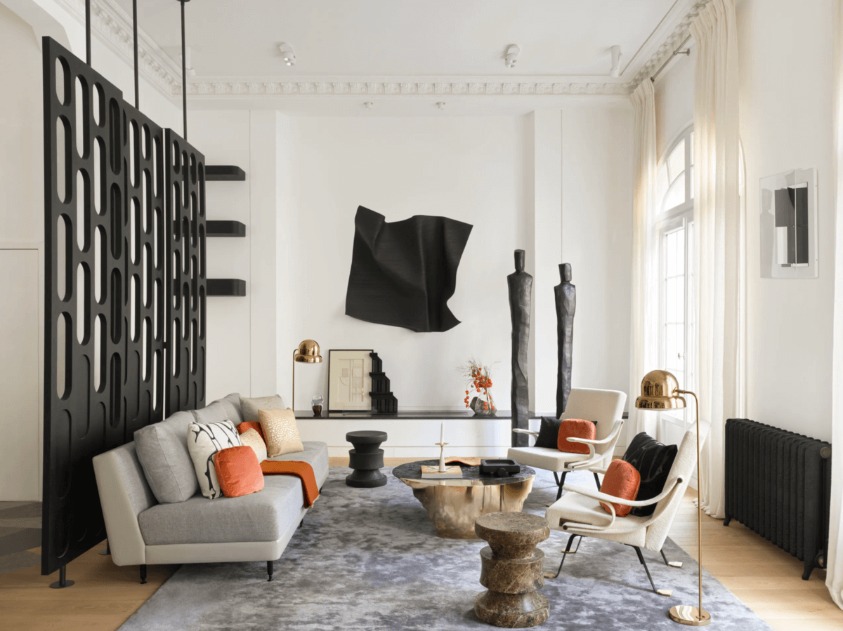
The Parisian lifestyle is associated with buying finer things. Luxurious surroundings, refined indulgences, and a fondness for beautiful goods may spring to mind. But it’s unusual to come across a project that completely embodies them all. This French design firm Le Berre Vevaud designed this luxurious Parisian home. Raphaël and Thomas stated that they wanted to create a family home that reflected their essence. It belongs to art collecting couples and their two children. In the first place, the designers needed to turn this Parisian home functional. The duo got surprised by the dimension of the house and its brightness. Starting with the first floor, the living area, dining room, kitchen, the designers planned an open layout to maximize the natural light. Moving forward, Raphaël and Tho incorporated a mezzanine to break up the six-meter-high ceiling. That included a high platform with a view of the dining room. Therefore turned into an office. While the mezzanine allowed breaking the high ceiling, the adjoining walls meant the creation of a larger room too. Additionally, the two big public rooms’ frame views add the same effect. From the living room, you can see the dining area. Le Berre Vevaud incorporated a cloudy gold leaf by Anne Féat Gaiss in the dining room. Below they added a black round-legged Olbia cabinet from their collection; minimal Sophie SÁssoit chairs from Maison Dadad surround a bespoke marble table. PICK INSIDE THIS LUXURY PARISIAN HOME In the opposite direction of the living room, there is a mural artwork by Martin Beger, a black wood sculpture by Charles Kalpakian, armchairs by Ignazio Gardella, and a coffee table by Yann Dessauvage. On the opposite direction of the living room, there is a mural artwork by Martin Berger, black wood sculptures by Charles Kalpakian, Ignazio Gardella armchairs, and a cantilevered bronze coffee table by Yann Dessauvage. Finally, Raphaël and Thomas added a partition to the sitting area and entrance elevator. The architectural brilliance of Le Berre Vevaud converted the majestic townhouse into a family home. Plus, their ability to interpret the couple’s massive art collection in a domestic context distinguished their work. For instance, the designer incorporated a 17th-century portrait by hand Hansen Rasch above a bespoke console in the entrance hall.The artwork is displayed harmoniously in a bedroom that can be mistaken for a family picture. The Parisian home is not only an exhibition of the couple’s art collection, but it includes a 1,000 square-foot spa. On the spa, Le Berre and Vevaud let their imagination run free. They created a dark staircase with waxed concrete to mimic the textures of stones. They built a raised platform beneath a gridded skylight to house a circular Jacuzzi. At the same time, they placed a shower room and hammam sauna on the opposite side. Both got covered with a constellation of microscopic mosaic tiles made by ceramics manufacturer Beton Blanché. Credits: Architectural Digest

Form PopUp Download Ebooks
Privacy policy
Please select a valid form

More Info

Please select a valid form

This form is currently closed for submissions.

NEW DECOR CATALOG

THE BOOK THAT WILL TRANSFORM YOUR HOME INTO A CHARMING PLACE.

NEW DECOR CATALOG
Privacy policy
Subscribe Newsletter Right Widget
Privacy policy
METAMORPHIK HOUSE AT DECOREX 2022

METAMORPHIK HOUSE AT DECOREX 2022

Step into our Metarooms reality and enjoy exclusive benefits

Privacy policy