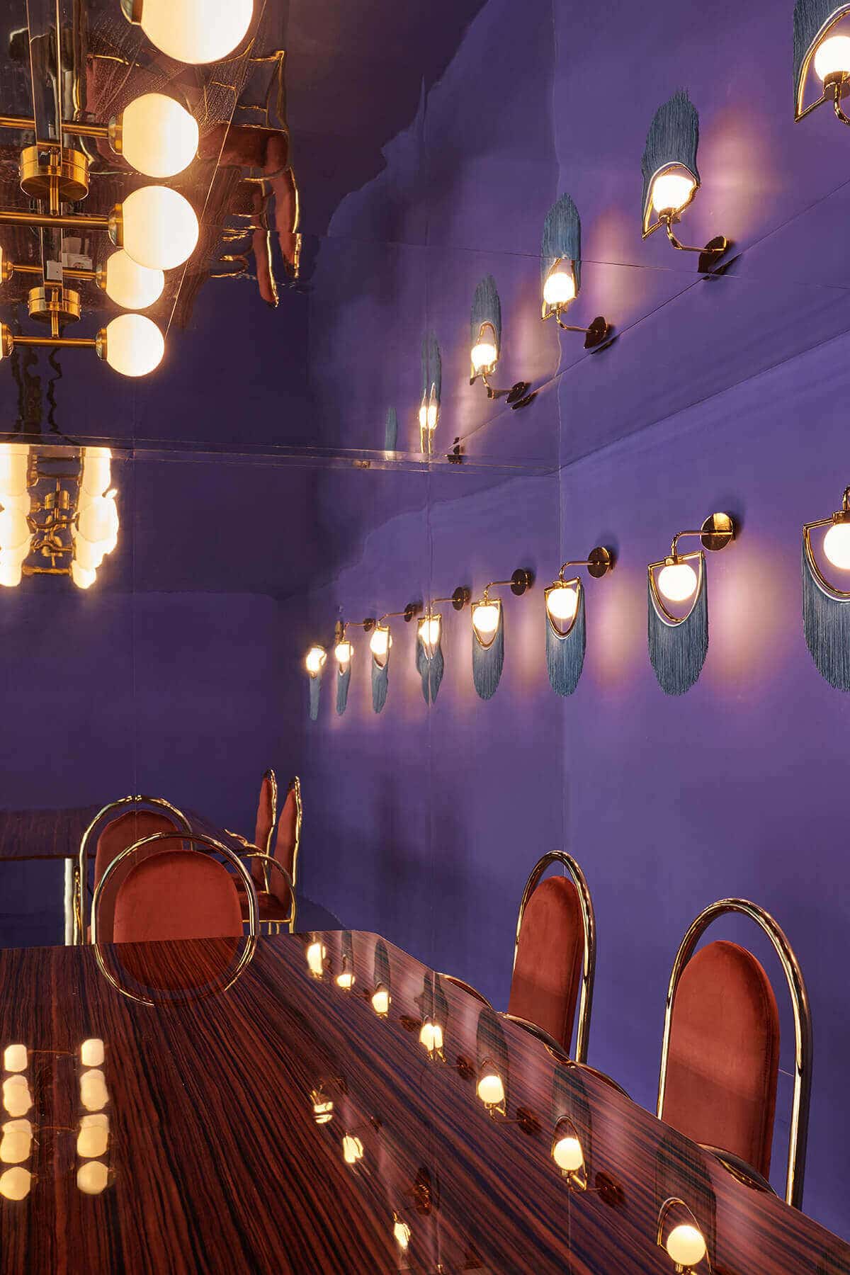
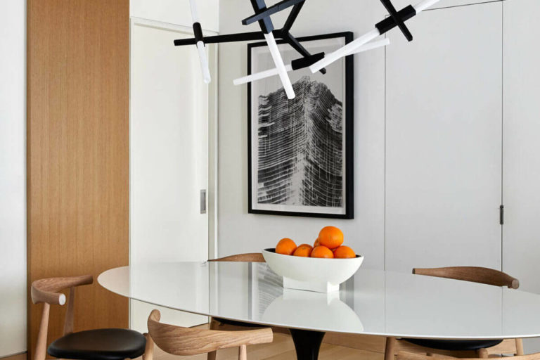
Very Peri is one of the 2022 Pantone Color of the Year. This new color honors the benefit of the digital world and, ultimately, the merging of physical and virtual reality. As a result, using Very Peri in interior design projects ensures an immediate sense of futurity.
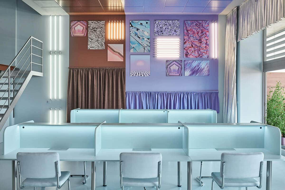
We searched the internet and discovered incredible interior design projects using the very peri color. And you will want to remember a few things, especially if you want to use this color in your home decoration.
Very Peri is simultaneously feminine, powerful, futuristic, and joyful. This blend of blue very peri is feminine, forceful, futurist, and cheerful.
This blue-red mixture is ideal for business interior design projects. In the residential interior, the color is a blast on tapestry, upholstery, and home furniture. And if you had to choose one interior design style to go with Very Peri, it would be the Memphis Design Style
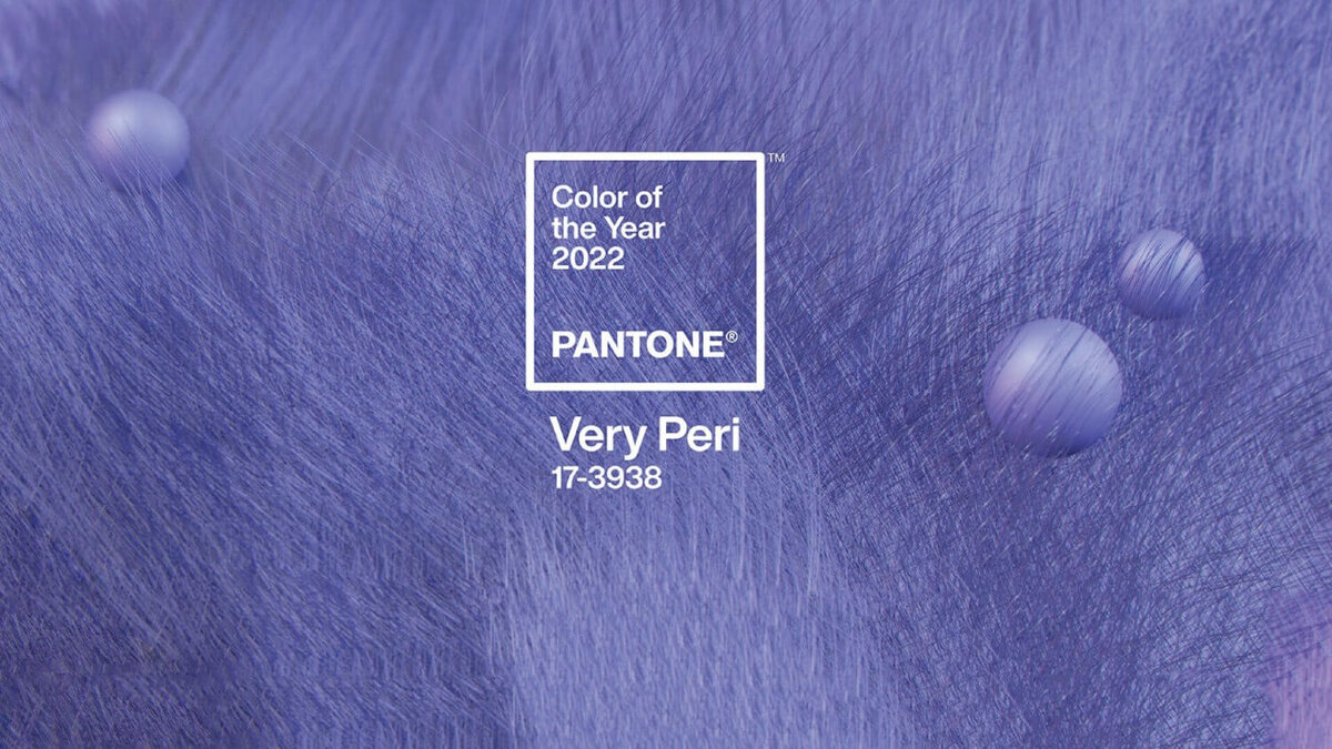
1- HARRY NURIEV’S APARTMENT, CROSBY STUDIOS
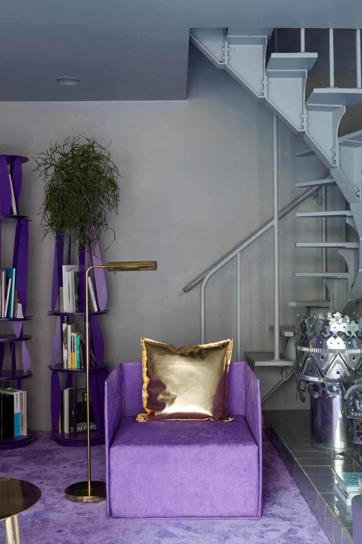
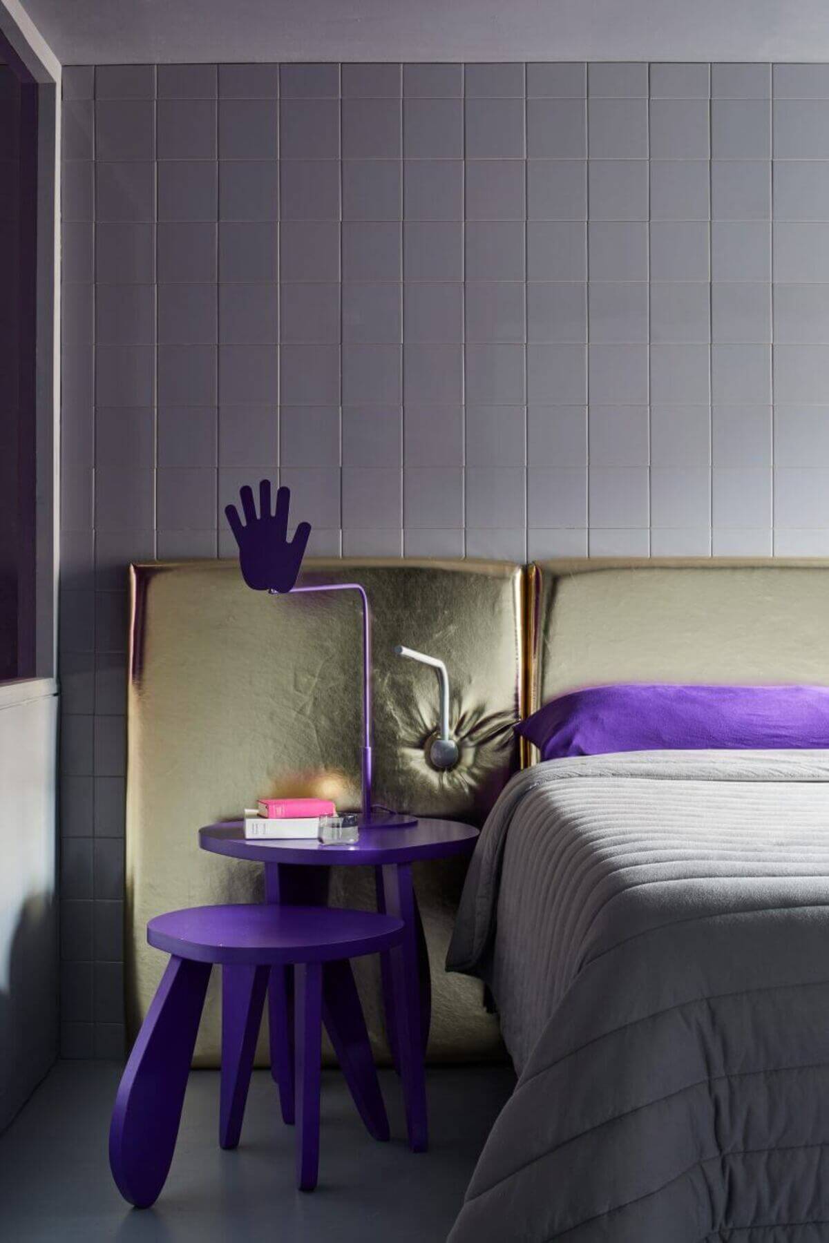
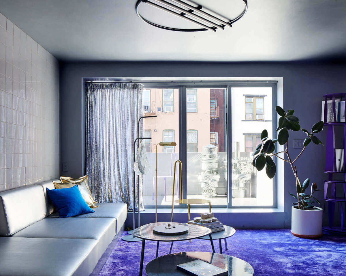
The loft of Crosby Studio´s founder and CEO, Harry Nuriev and Tyler Bilinger, reflect their personalities as a couple and creators. The couple established themselves in New York´s famous Nolita neighborhood.
The couple home is a stunning example of how to incorporate very peri tones in our home. With woodwork, upholstery, furniture, and homewares, Crosby Studio introduces its modern and strong story into the futuristic residence. The color scheme of the apartment is white, pastel blue, gold, and silver fixtures.
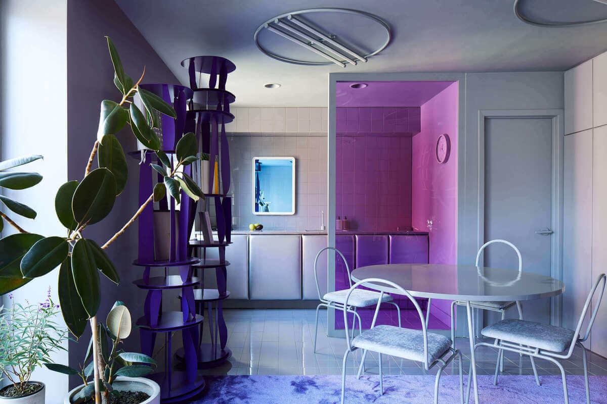
2- CAFE KRUJOK, EDUARD EREMCHUK AND KATY PITISKAYA
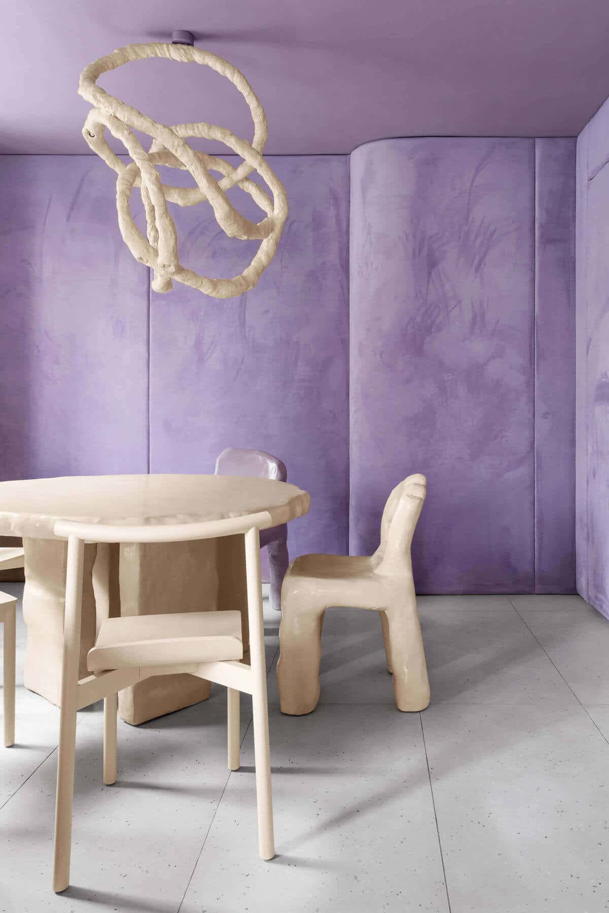
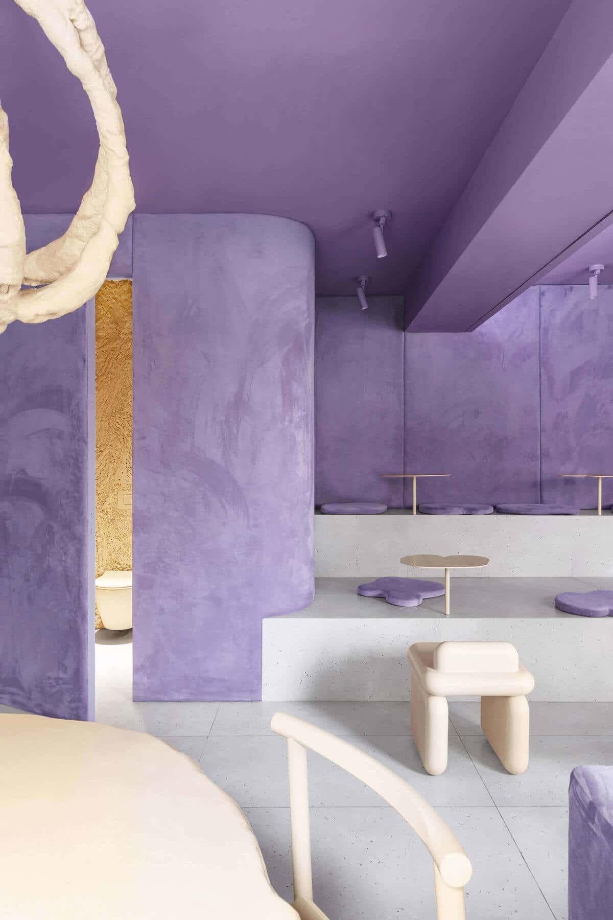
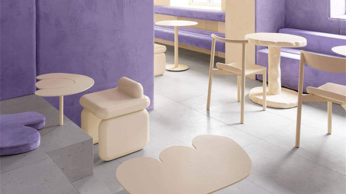
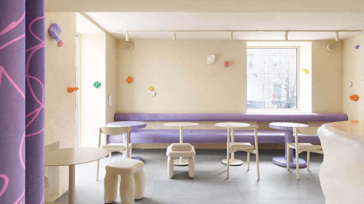
Café Krukok is an incredibly tasty commercial interior in Russia named after a round doughnut. The designers, Eduard Eremchuck and Katy Pitiskaya are the faces of this silky environment.
The velvet walls, chairs, and seats are designed to seem like colorful donuts glaze.
The Cafe Krujok’s sandy white furniture has a smooth feel that complements the purple velvet. In interior design, Very Peri has the ability to create an otherworldly reality.
3- DE GOURNAY SHOWROOM, INDIA MADHAVI
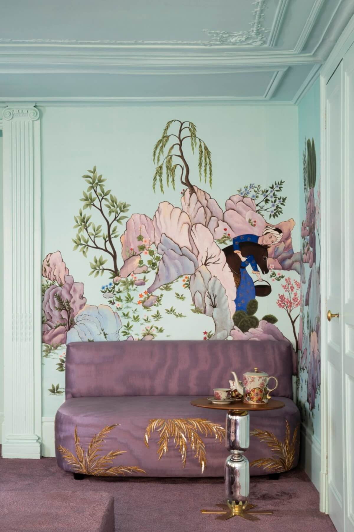
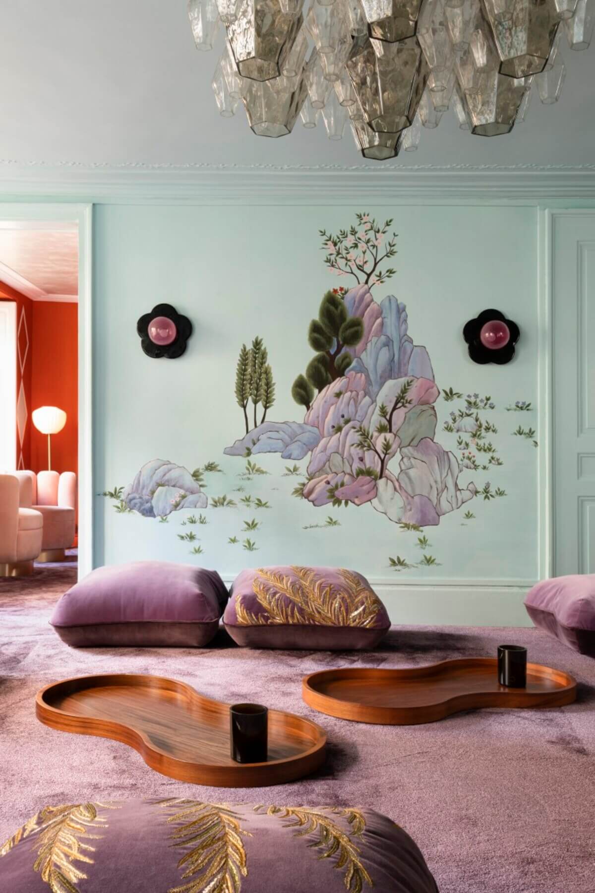
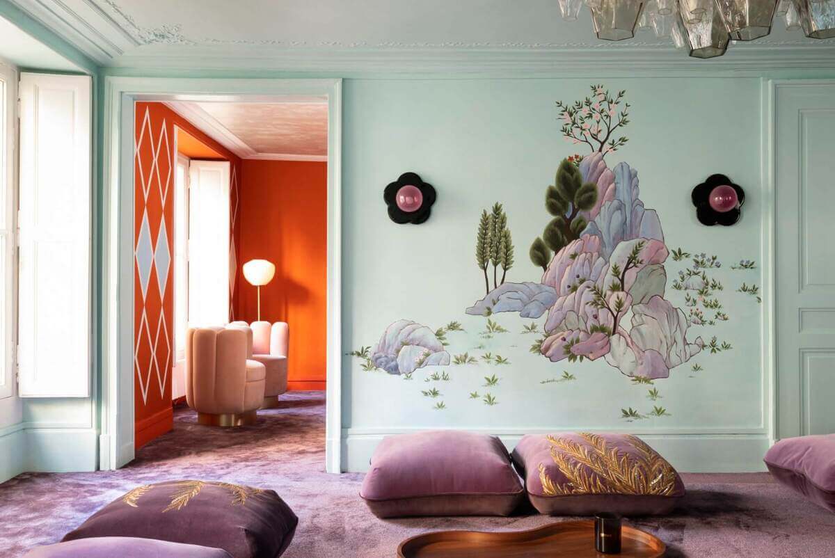
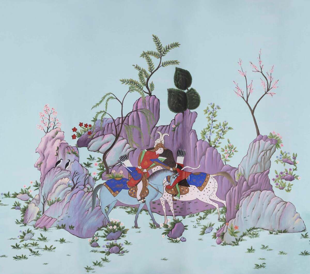
India Madhavi has a lot of knowledge with combining colors. She and De Gournay used a striking color scheme on the showroom in Paris. From the lilac and purple to the reddish hues and vivid orange.
The wallpaper, “Abbasi in the sky” contracts the metropolitan environment with oriental patterns.
4- HOME IN HISTORIC MUMBAI, SRILA CHATTERJEE AND MAHESH MATHAI
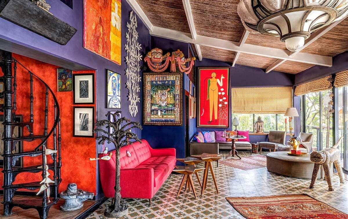
Very Peri may be utilized in interior design to resurrect a prior emotion or memory, generally one of happiness and warmth. At least, that’s what Srila Chatterjee accomplished in the Chatterjee’s Mumbai residence.
Srila Chatterjee and her husband remodeled their house into a historic area of Mumbai. The walls of the living room have a purple tone that combines with a very peri tone.
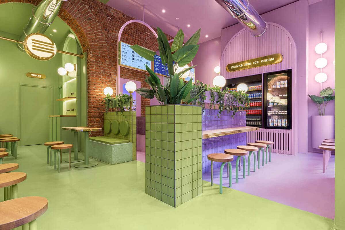
5- BUN BURGERS BLIGNY, MASQUESPACIO
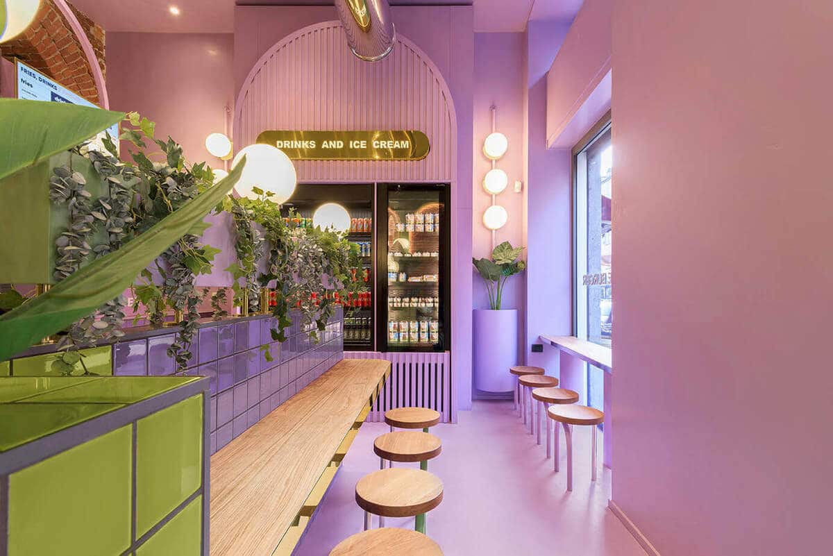
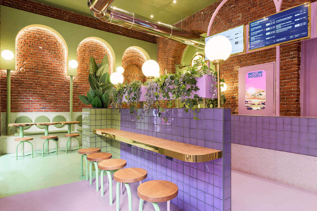
Masquespacio, located in Valencia, Spain is an award-winning creative firm.Founded in 2010 by Ana Milena Hernández Palacios and Christophe Penasse.
The studio creates bespoke interiors and branding projects thanks to the unique methodology that results from the two different backgrounds In interior design and marketing of the designers.
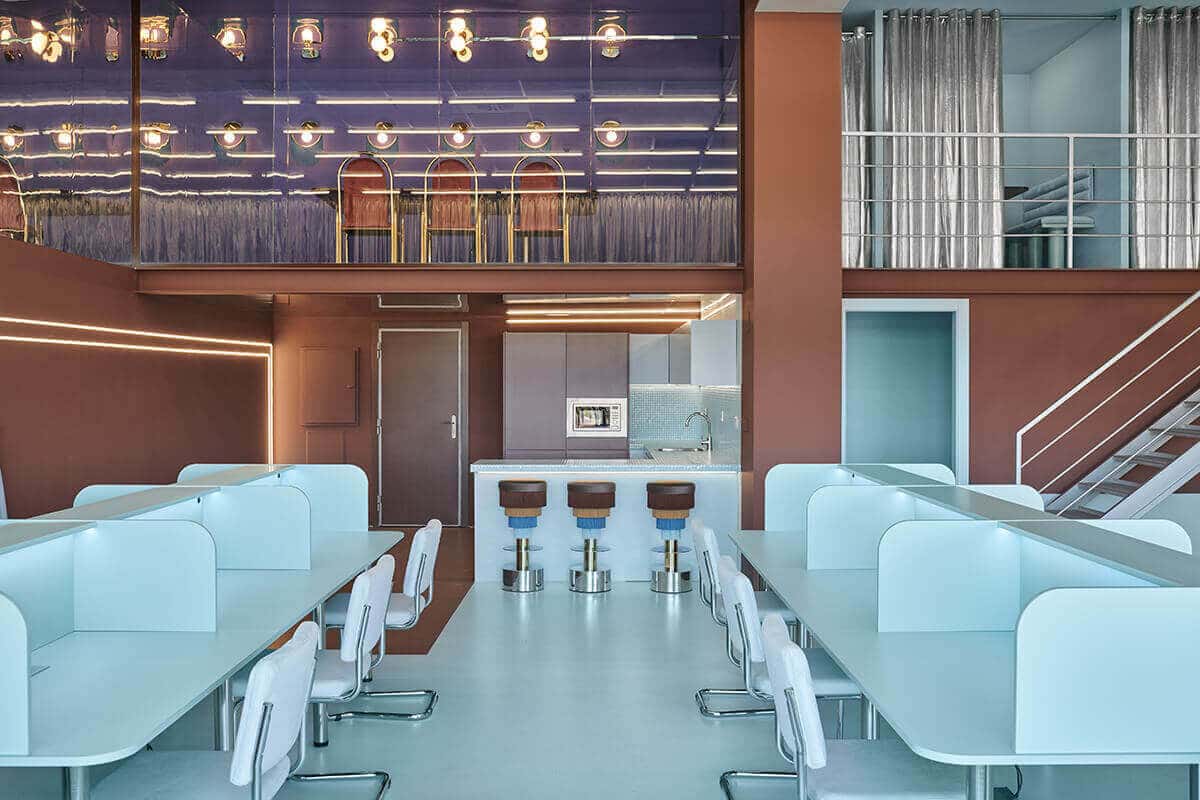
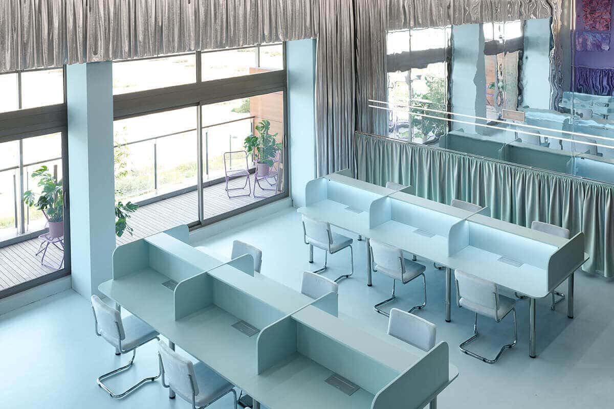
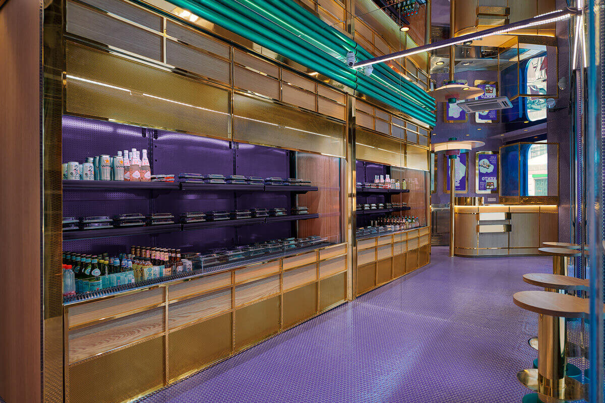
Several of Masquespacio’s commercial interior design projects have a lilac-blue color that hovers about the Very Peri pigmentation.
6- CABINETTE CO-WORKING, MASQUESPACIO
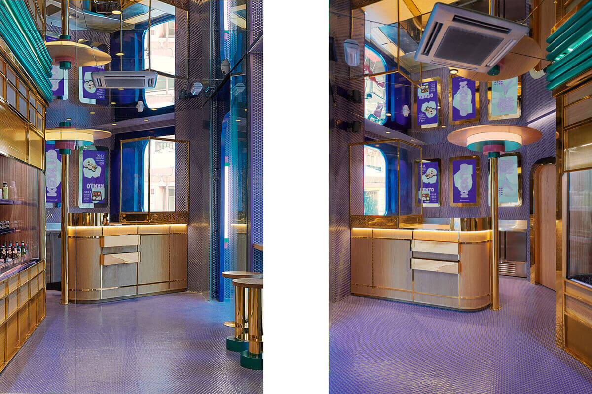
7- KENTO TAKE AWAY STORE, MASQUESPACIO
8-MARIA NILA HEADQUARTERS, ASKA
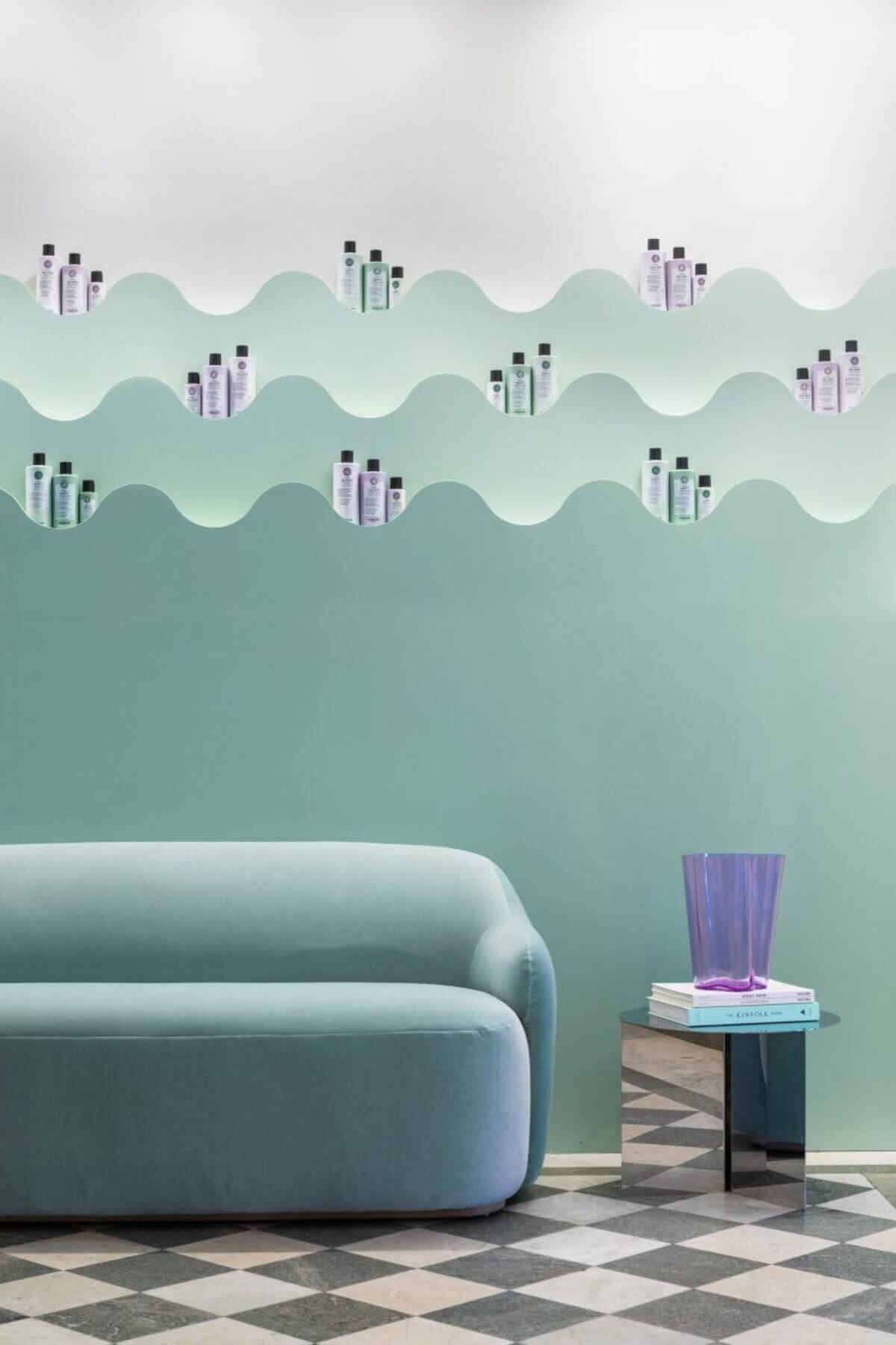
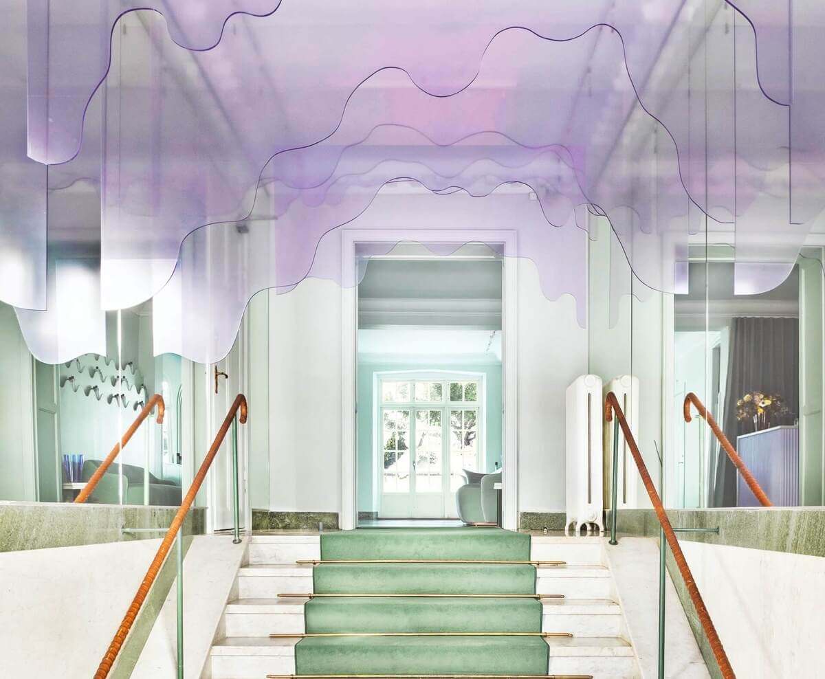
Maria Nila’s office and hair shop in Stockholm is bold and flavorful. The Swedish architecture firm ASKA chose a pink, peach, blue, and lilac pastel color scheme.
The Swedish firm completely renovated the four-story structure to provide an interactive experience. The Maria Nila headquarters have organic-shaped accessories, a color palette that appeals to all senses, including smell, and a reviving color palette.
ASKA employs plexiglass to create a dripping shampoo-like installation on the entryway to the workplace and salon. A very Peri gradient is created by placing purple acrylics and glass items against blue lighting.
Maria Nila’s office can find the Memphis Design style in furniture such as mirrors, dining tables, and side tables.

Credits: Dezeen
