ENJOY 15% OFF ON YOUR FIRST ORDER | CODE FIRSTORDER15 ENJOY FREE SHIPPING OVER 500€ DISCOVER THE ATELIER, CUSTOM YOUR ORDER!

Home World

Caribbean Villa – A Modern Paradise by Studio Axe

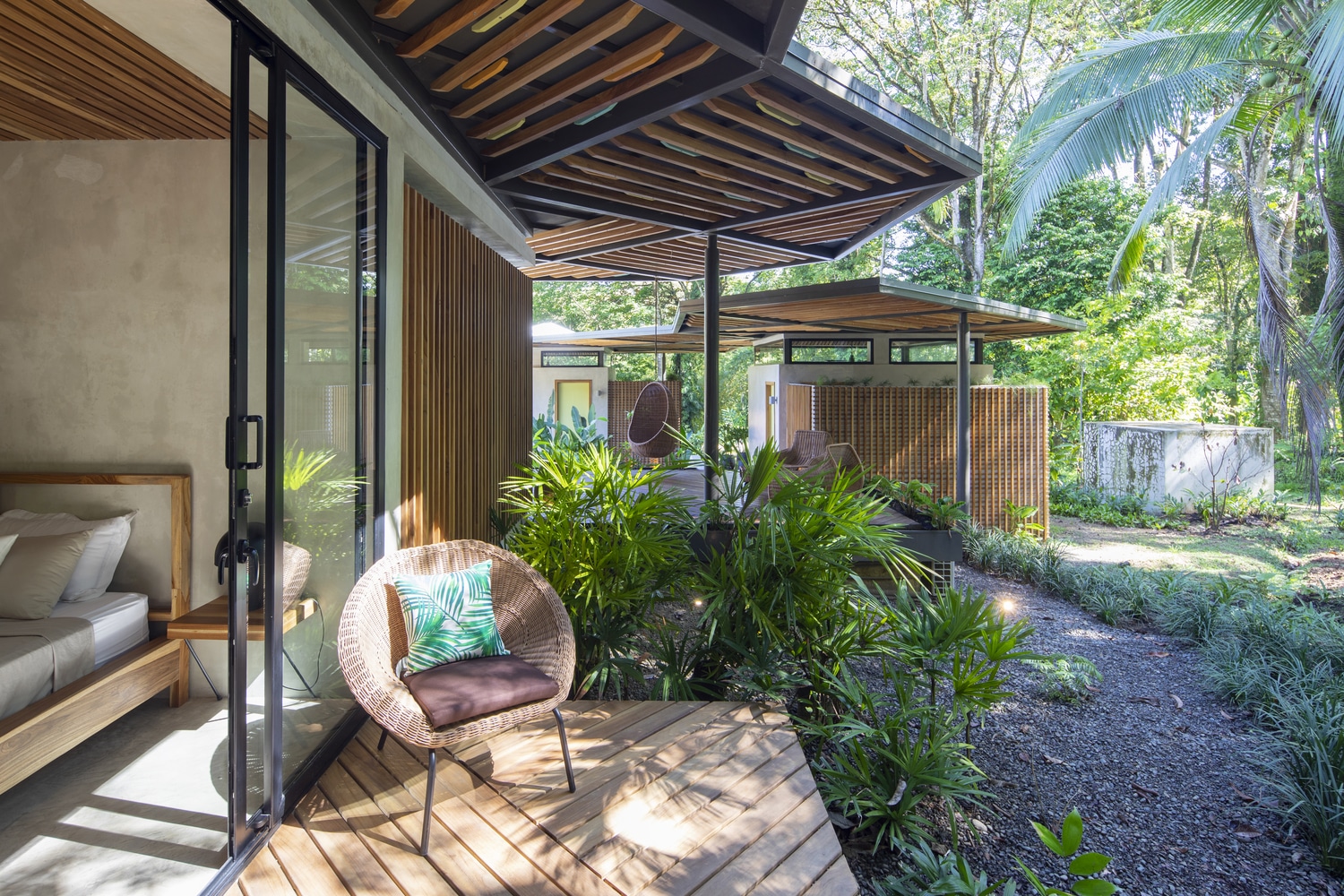
Caribbean Villa is a modern paradise, a unique oasis with all the comfort you need in a home. Studio Axe are responsible for this amazing project we are about to find out. This Caribbean Villa, by the Architecture Studio Axe is located in the jungle of the Caribbean Coast of Puerto Viejo. Here, we can a series of pavilions that are a combination through a woven network of pergolas. By doing this, we can see how they blend so well with the jungle around. That way, creates a unique sense of unity including an internal courtyard. This villa is a mix of several things, including a home under the trees. It has place stepping down the mountain because of the topographic condition, so it was easier for the architects to build it. This place has also solar system generation, passive bioclimatic design and water-efficient systems, so it is a sustainability project. Its construction is simple, through a series of triangles, the house was raised modularly and each person’s private or open space was encased through dividers and glass hence making a sensation of a organize that can proceed developing in time. Impossible not to fall in love with this amazing paradise home, it is definitely a dream home in the middle of nowhere. We loved it! Credits to: Archdaily Photography: Andres Garcia Lachner
Beirut Home – How To Mix Modern and Traditional At Once

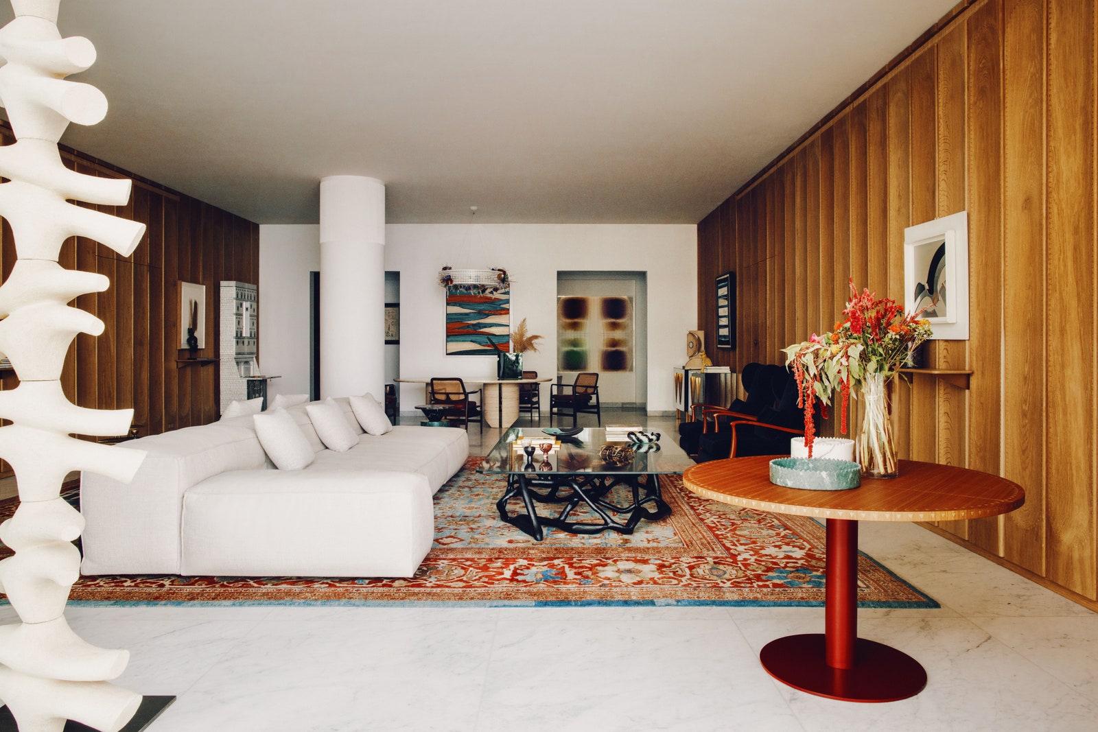
Pick inside this Beirut Home and find out how modern and traditional design and decor can combine so well in one place! Luxurious Apartment in Beirut David and Nicolas are responsible for this Beirut Home transformation. Both said that they “… had this challenge of building an identity.” This apartment belongs to a Lebanese Egyptian husband-and-wife, and they already have been working with them because David and Nicolas create their daughter’s Paris apartment. At this point, they kinda know what their clients want. “… the couple wanted an inviting space that married modern–but not too modern—elements with traditional pieces. First and foremost, it had to still feel like a home. “Their houses have very good energy when you enter,” notes Raffoul. “Very welcoming and warm.” We are about to see a home that is definitely modern, but, at the same time its not too modern. We will find a clear dialogue between traditional and modern design. The interior designers said that “We’re not here to just change their way of living. We want to adapt, together.” First things first, regarding the apartment that is located in a luxurious complex by Herzog and de Mourn. We are in love with this view from the balcony, you can see Beirut’s downtown. For the bathroom the interior designer chose a large circular mirror and an handmade chair perfectly located in the back wall. After the main bathroom, there is the main bedroom that is cozy and simple. Besides that, it has a balcony with outstanding views! The guest room has a blue wall and red sconces from Galerie Kreo, hang on both sides of the bed. Besides, there is also a painting by Pierre Malbec. This is the definition of a dream kitchen with a unique seating area and a stunning view. The dining room of this Beirut Home is another example of how traditional and modern can mix so well together. With a chandelier from Nilufar Gallery, the table is a David/Nicolas creation that was designed for Carpenters Workshop Gallery. Seating spot where it is possible to relax and read a book. The cabinet is the main star here and belongs to Fornasetti. Besides that, we can see the handmade wooden panels with engraved triangles motifs inspired by the sculpture of Egypt. The seating corner combines a trio of bronze tables by Franck Evennou, the French furniture maker and further artistic flair. Last, but not least, the living room of this Beirut Home that has everything in the right place. One curious thing, the sculpture in the corner arrived home in pieces and was built by hand, with help of all the team. Credits to: Architectural Digest

Multi-Functioning Room – The Main Secrets to Have One

Multi-functioning room and all the secrets to have one! We help you with some design ideas for this to happen! According with the interior designer Jennifer Ward-Woods, “With COVID, families are all gathering in one place, trying to watch TV or do work at the same time,”. At this moment, “There is a real need for multi-purpose spaces.”. 2,3,4 Layers of Lighting When redesigning a room, light installations are like an embellishment. They are set within the space after the major pieces are already in order. Barbara Elliot, interior designer, says that, multi-functioning rooms need every type of lighting. Why? Because they are going to be used for different purposes. Storage Everywhere Adequate capacity is one major key to guaranteeing that a multi-purpose room doesn’t see like a catchall for family variety. The first option could be cabinets or shelves, because they can be customised to fit the computer or the video-game consoles. Flexible Furniture Satisfactory capacity is one major key to ensuring that a multi-purpose room doesn’t appear like a catchall. For the domestic office-guest room combo, Elliott and Ward-Woods turn to divider beds and sleeper couches. The previous can vanish completely when not in use. On the other hand, the last mentioned capacities as additional seating within the office when visitors aren’t in town. Create Different Zones If the room has space, you can have different areas for different activities. According with Barbara Elliott, “We normally start with the biggest wall, and from there, plan the best way to lay out the furniture,”. “If there is an architectural element or focal point built in, like a fireplace or large windows, we’ll build around that.” First, you can begin with the largest zone, then you move to the smaller ones around it. Set Up Your Uses Last, but not least, decide how you are going to use your space, work, play, a family room. After that, you start the work and make the best out of it. Transform your room into multi-functioning space! Credits to: Elle Decor

Apartment Decor Inspiration – How to Make it Look Bigger Part II

Apartment Decor Inspiration, part II! Where we can show you some design ideas to look a little bit bigger that he is. If you want to read part I, you can find the article here. Enjoy the Outside Space If you have a balcony you need to make it special, like it’s an extension of the interior design. Simple, unique, light, these are the main characteristics of a soft exterior decor. Room Dividers are Always a Good Idea Room dividers can be a brilliant way of including the feel of more rooms without really having them. They are moreover inconceivably exquisite and can act as a captivating articulation piece. Wall Decoration – Neutral Hues This one might sound evident, but neutrals on the wall will bring light into any room and give the sense of space, even when there’s not much. The Right Furniture Instead of going straight to the floor, you need your furniture to be lean. Meaning choosing stools with more slender legs and directing clear of bulky couches with covered up legs. Curtains Style In order to have a Apartment Decor Inspiration, you need to be sure that you use curtains, but most of all, that they reach the floor. That way, it will give the illusion of length. Besides that, it will be wise to use more neutral and natural fabrics. Window Covers In a perfect world, use subtle blinds or screens, don’t select overwhelming shades because they will close off the space. Unpretentious blinds or shades will let in light without compromising the space.

Apartment Decor Inspiration – How to Make it Look Bigger

Apartment Decor Inspiration, how to make it look a little bit bigger that what he is. We give you some ideas in order to do that! Stay with us and keep on reading! Glass Decor Coffee tables or dining tables are an incredible way to consolidate glass into a room, which immediately liberates up space. You may elect a unique table with a touch of glass to immediately create some space. Furniture Need to be Away From the Walls Move out furniture from the borders of the room will deliver the whole space a facelift. Be that as it may, this trick is most compelling when your furniture is smaller than it would have to be pushed against a wall. As an example you can select a two-seater lounge chair rather than a two-and-a-half-seater seat, because when pulled away from the wall, it’ll look more proportioned. Artwork All Over the Wall A trap of the eye, mounting expansive works of art on littler walls can make them see greater. If you prefer, you could incline toward to hang parcels of work of art, scramble it throughout the house rather than lumping it all on one divider. It’ll keep things feeling new and open.  Nooks or Entryways Unused space could be a total no in an loft. Utilize any hallways or niches by including something within the wall hanging. Here you can use simply a piece of furniture or a painting. By doing that, it will create a unique feeling of more interior zones. Mirror Are Always a Good Idea Our Apartment Decor Inspiration continue with what? Mirrors! Mirrors have the ability to create instant space in a home, because it will make it bigger. Place them everywhere if you want it! Bookcases? Or Shelves? Bookcases are bulky and include pointless space. In case you can utilize floating shelves. They are an elegant way to show books and adornments. If you cannot hang on the walls, go for bookcases with lean edges or metal outlines, so they mix in as much as conceivable with the surrrounds. 

Healthier Home – Get To Know Four Innovative Ways

Healthier Home is something that we all must want, because it is good for us too. So, we’re going to present four ways in order to achieve it. Get the Lights ON Insufficient lighting doesn’t fair make it harder to see things in your house; it can trigger physical and mental wellbeing issues, counting eye strain, cerebral pains, weakness, stretch, and uneasiness. Private lighting has gotten to be much more intelligent in recent years, to the point where it can be modified to imitate the revolution of the sun. Creators call it circadian lighting, after the circadian rhythms of our 24-hour inner clock. This is just an idea, then you can adapt to your place! Your Comfort First The consolation and ergonomics of our homes (or lack thereof) is another zone that’s is beneath a magnifying lens during the pandemic. Whereas numerous individuals have returned to working in an office full time, others are still in flux or indeed in a for all time adaptable circumstance. In case you will be at domestic indeed fair a day or two a week, it makes sense to contribute in a workstation. Aside from your work area, which might appear just like the most self-evident put to incorporate ergonomics, your entire living space can advantage from many changes. Bring the Outdoors In, Please Increasingly interior designers are grasping it in a enormous way. With components like lighting, craftsmanship, and the utilize of normal materials. Not only in furniture, but also in flooring. Whether you’re considering a major remodel or essentially reviving your space with a couple of unused pieces, one of the finest ways to cultivate a association with nature is to obscure the line between the inside and out. Always Clear the Air One of the most important things at home is the quality of the air, even more with the pandemics. What you have to do is simple, for example you can vacuum once a week. You can also use candles and wood-burning fireplace in order to help you. These where some ideas for a Healthier Home! We hope you liked it, and don’t forget to stay tuned for more! Credits to: Elle Decor

Furniture Design Trends for 2022 – According with High Point Market

Furniture Design Trends for 2022 combine a series of decor ideas you’ll want to adopt for your home. Stay with and find out everything. Fluted Repeats The most simple weave structures, the basketweave’s uniform twist and weft will lead to a family beat. It’s the case especially when employing a wide fabric, where the over-under beat produces a luxuriously material surface. Pleats, If You May Curated Kravet, a very well known market, has began with a “I Create” custom lampshade program, where designers could create their own personalised lamps. Besides that, they also get to choose all the materials they want! Around Round Tables Goodbye to the calm breakfast nook—this season’s circular table bases have ended up a clear canvas for making a sensational moment. Sprawling Scenics For those motivated by the past, documented libraries and historical centers are the play areas of choice. This is a good example of that, because when you bring the old your home will have unique style. Besides that, adds elegance and class! Arches Making Their Way Showing up all over from Roman engineering to Spanish villas, Craftsmanship Deco plans, and numerous design movements in between, the contoured device has become less structural and more of a enriching theme through times. For example, the Magmus credenza by Milling Road Originals for Baker. To conclude, these were the Furniture Design Trends for 2022, we hope that you liked our article. Now, its time for a few changes at home, if that’s what you desire! Credits to: Architectural Digest

Modern Living Room – Choose the Right Sofa for Your Home

Modern Living Room is nothing without the perfect sofa. That is what we’re going to talk about today, the best couch ideas to complete your living room decor. Yellow Tones First, we begin with some Middle East vibe, where colors make all the difference at home. They are used to colourful sofa designs, warm colors in the walls and decor. That is the message we want to pass out to you, colors such as yellow or red, or even orange a good choice for a Modern Living Room. Gucci-Style Sofa This entire living room is a reminder of Gucci-Style. It is an explosion of colors and materials, but also the perfect combination between traditional and contemporary. The velvet sofa will provide comfort and he is without a doubt the center piece of this room. Mid-Century Elegance Hommés Studio has all the interior design details in order to provide you the best living room decor, including the sofas. This mid-century interior displays wisely blend vibrant colors with a neutral pallette, that connect the space with emotions. Comfort Sky Blue This sky blue living room is a demonstration of comfort and warmth. That unique place where you’ll find peace, freedom and freshness. So, as you can see, a sky blue sofa is very good choice! Maximalist Design Maximalist Design is bold and daring, It is also a very good option for a modern living room. It is an extravagant solution for an extravagant mind. Bold Colors Jean Porshe is the interior designer of this outstanding living room that has joy and dynamic. This is a fantastic mixture of modernism and baroque pieces. This great choice of bold colors for the lounges create an intriguing space welcoming guests with energy and harmony. Royal Green Detail Green details will bring a forest vibe to your living room! It is a very unique connection between green details, patterns and textures. A pastel green sofa perfectly complements the set, while a shiny luxurious sideboard add glamorous touch to the interior. Mix Chic and Elegant Kelly Wearstler is the responsible for this decoration and we are in love. Kelly is never afraid of combining different colors and different patterns because she knows it will work. Memphis Design Memphis interior design in a modern living room is a good choice, we can guarantee you that. Once again, bold colors and exquisite patterns make all the difference. If you’re looking for a true revolution in your living room, this is the way to go! Ocean Blue Decor Blue for the living room, here is the result! When blue reigns you can only feel peace and relaxation. This were our Modern Living Room ideas for you, we hope that you now feel inspired for a change at home!

Indoor Plants for 2022 – According to the Opinion of Experts

Indoor Plants are always a good idea, because they can transform the place where they are. Besides that, there’s fresh and pure air everyday in every room. Get to know the opinion of four experts regarding this theme! Larger Houseplants 2022 is the year for Indoor Plants. One of the experts is Maryah Greene and she says that “larger houseplants are going to be the statement pieces of next year.” Hilton Carter, another experts, believes that the Ficus Audrey (a plant) can grow up to 50 feet and has the ability to transform a place. Climbing Plants Jarema Osofsky is interior designer and landscape designer, she believes that flowering plants will be the main trend for 2022. “…as well as plants that climb like Rhaphidophora tetrasperma, which really takes on a sculptural quality as it climbs,” . She also says that “By bringing flowers and vining plants indoors, the goal should be recreating what you’d experience and see outside. Jarema adds, “You can even guide vining plants with hooks or use them to frame a window in your home to give a jungle feel.” Ferns Hilton says the ferns do a very good job in rooms with high humidity. “They grow a nice trunk, becoming more like an interesting blend of fern and palm.” Ferns work as self-care plants and they are perfect. Maryah says that They get a bad rap because they are kind of difficult to care for. But I have a client who only has ferns. And it is truly their meditative process.”. We can conclude that Indoor Plants are always a good idea, and they will be a choice for 2022. Credits to: Architectural Digest

Elliott Barnes and His Megève Ski Chalet That You Must Know

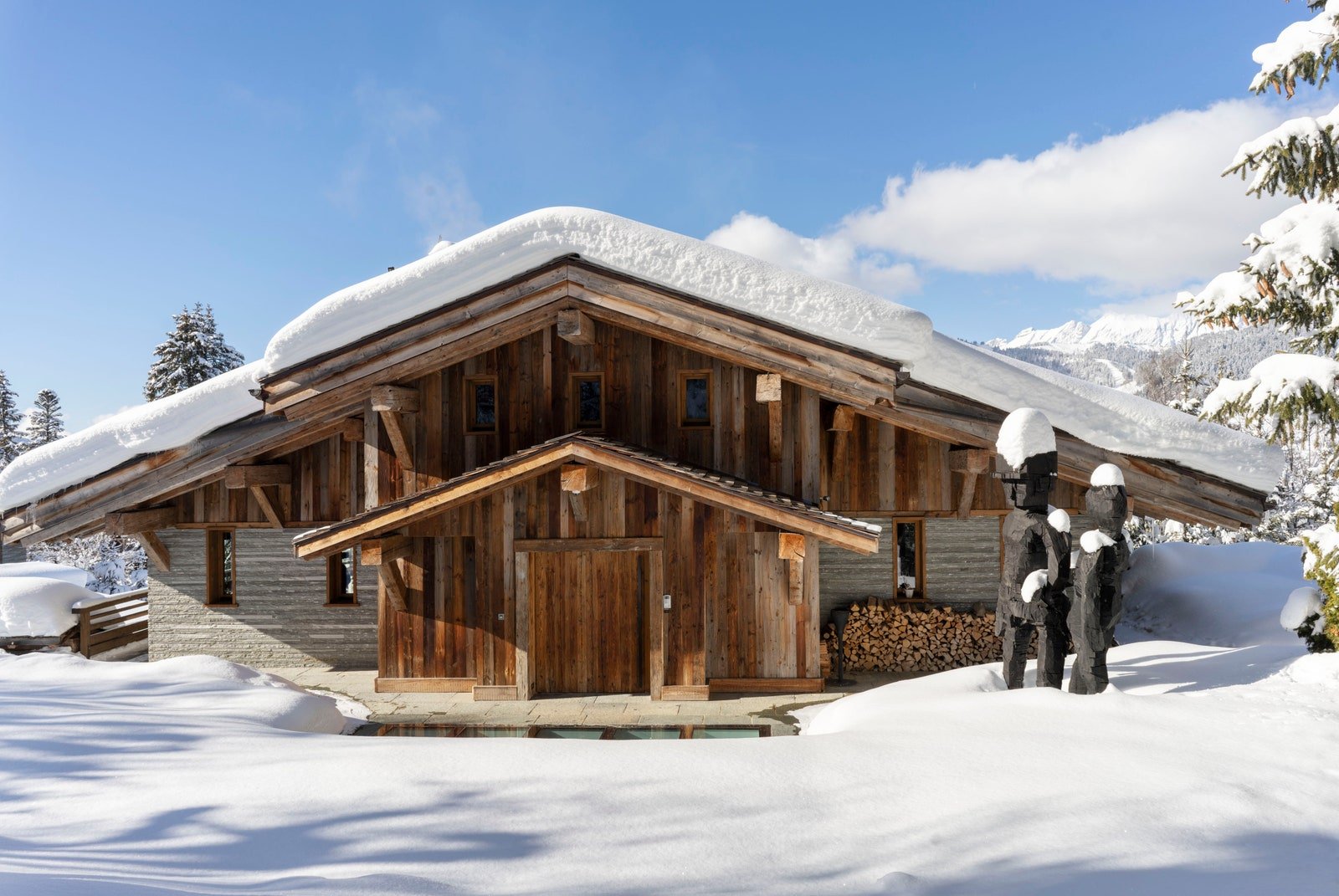
Elliott Barnes is one of the interior designers of AD100 for 2022 and we want to show you a little bit of his work. Stay with us and get to know more! This home belongs to Hélène Nguyen-Ban and she is an art lover. For many days her and Elliott talked about art, family and togetherness, that is exactly what we are going to see here. This place is located in the French Alpes and needed to have the right architect, so Gérard Ravello stepped in. Together, they created a holistic home, where there is a unique connection between the interior and the exterior. Now, let’s talk a little bit more about the house and it’s secrets. This is the dining room with dining table and chairs that were found in the flea market. Besides that, there is columnar sculpture by the hand of Pascale Marthine Tayou. The kitchen has every single details from La Cornue, that includes the range, hood, and cabinetry. According with Hélène and Elliott Barner, this is called the small saloon. Here we can see a Hans Wegner lounge chair, side by side with a Guillerme et Chambron sofa. There is also a Kerstin Olby chaise long and a judge’s chair by Piette Jeanneret and Le Corbusier. This work of art takes our breath away, it has the hand of Benoit Huot and its over the main stair hall. French Alpes Home As we said before, Hélène is passionate about art and her collection of objects is from all over the world, but here, we can see objects from Japan, China and Korea in a vintage table from Guillerme et Chambron. This is a very unique corner, with Pierre de Vals stone and pine. We might think that this spot belongs to the office! Welcome to the primary bathroom, where Elliott Barnes place a William Holland tub and Astom Matthews fittings. Both showers belong to Volevatch. After the primary bathroom, there the primary bedroom. Simple decoration and amazing views. The children’s bedroom (one of them) has Dear fabric that covers the headboard. Once again, the snow is the main view here. Now, get inside the children’s bathroom with sinks that belong to each children. This is an amazing idea for the kids! The interior pool needed to be here as well! There is retractable floor covers the pool in order to create a multi-functional space. The whine cellar features a Zhan Wang sculpture, with a view to the granite hillside. Last, but the least, a view from the outside. Elliott Barns said that “Hélène likes to live with the works she collects almost in the way one would live with family portraits—everything has a connection and an emotional resonance,”. “Pieces move in and out, so the installation isn’t static. Like the house itself and the experiences it nurtures, the art feels alive.” Credits to: Architectural Digest

Design Trends for 2022 – According to the Design Experts

Design Trends for 2022 seems to be the right to begin the day! The new year is just around the corner and we want you to know everything! To begin this article we have something that Gemma Robert, head of Interiors at WGSN, said “Rather than specific trends declining, we are seeing the lines between different styles blurring,”. She gives as example, the minimalist and the maximalism, and how both styles are closer than ever. The Curves At this particular moment, we ain’t ready for sharp edges, so we keep the curved interior design. Riberti believes that “Comfy, curvilinear, welcoming forms will be paramount,” she says. “Not necessarily plump and over-the-top exaggerated, but soft to the eye and the hand to create an overall relaxed and comfortable feel within the space.” Sensorial Moves One of the most important Design Trends for 2022 is the sensorial experience you can provide at your home. The interiors need to feel as good as they look, and this is something important to keep in mind. Lisa White, one of the experts, believes that “Scent has taken center stage during the pandemic, and people are scenting specific areas of their home with different scents as a way of inhabiting space with all of their senses,”. Contemporary Conservatories All the interior design experts have one thing in common, their collective yen for biophilia. But they believe that for 2022 it will become more sophisticated. White says that people want to bring the outdoor design to the indoor. “We will see the rise of the indoor tree—especially lemon trees and olive trees—taking center stage in large pots.” Landscape Unique Colors and Textures Earthy tones, greens and blues, are always good choices to decor a home. Michelle Lamb, the editorial director at The Trend Curve says that “Perhaps because humanity has never needed the healing powers of nature more than we do at this moment, there is a quest to take this approach even deeper.” 

Chinese Feng Shui Philosophy – How to Decor a Home!

Chinese Feng Shui Philosophy is a unique way to decor a home. It is getting more and more popular for designers and interior decorators! Let’s find out more about it! Feng Shui is a Chinese Philosophy that has as main objective, plan interior design spaces that serve well being and happiness. Feng means wind (something that we cannot see), and shui mean water (something intangible). From here, we can conclude that our lives can be ruled by forces that are invisible and intangible. Chinese Feng Shui Philosophy has a deep connection with astrology and how the stars affect us. Regarding interior design, Feng Shui design will give the right energy to your home. This unique philosophy helps us understand which patterns, colors, objects and texture we should choose and in which areas. That way we will find balance and positive vibes at home. This interior design style gives specific details that we must follow. Just like objects, accessories, that we should choose in order to achieve this particular style. Feng Shui is related to three different ancient Chinese astrology concepts: the five elements, yin & yang, and nine life areas. The five elements (fire, wood, earth, water and metal) are related to specific color palettes and specific season as well. They interact in different ways. Wood means growth and vitality, but can be destroyed by fire and metal. But water helps the trees grow. The season of wood is Spring. Fire means red color and summer and he is the strongest of the elements. Passion, love and energy, but also expansion, and transformation. Earth is the basics of feng shui philosophy, because it gives us life and feeds us.  Metal leads us to intelligence. Which means that is good to place in the office or study room. Water is the most vital element of the five. Help us to relax, it’s the element of winter! YIN & YANG Yin & Yang means balance, so it’s present in the relaxation spots of the house. Last, but not least, the Bagua Map with nine life areas that will help you planning the spaces that will cover all of these life areas in your house. The nine areas are, wealth, fame, love, family, health, children, wisdom, career and helpful people. Feng Shui will provide you bright, positives vibes and powerful colors! That way, your house will be even more complete!

Form PopUp Download Ebooks
Privacy policy
Please select a valid form

More Info

Please select a valid form

This form is currently closed for submissions.

NEW DECOR CATALOG

THE BOOK THAT WILL TRANSFORM YOUR HOME INTO A CHARMING PLACE.

NEW DECOR CATALOG
Privacy policy
Subscribe Newsletter Right Widget
Privacy policy
METAMORPHIK HOUSE AT DECOREX 2022

METAMORPHIK HOUSE AT DECOREX 2022

Step into our Metarooms reality and enjoy exclusive benefits

Privacy policy